Section 2.1: samples and populations
Definitions are given for individual observations, sample of observations, variable, and population. A typical way to format data is in rows. Each row would be an individual observation. The variables are columns. The statistical population is all of the individual observations that you could possibly make (either that exist anywhere, or within your sampling area). Your sample of observations comes from this population. Generally one samples your observations from a population, but it's usually not feasible to get every individual from the population. So you end up with a dataset that is a sample of observations from a population, with the variables you've measured on each individual observation.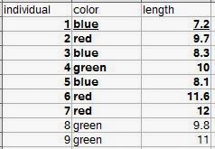 |
| Let's say all nine rows are our population. The bold observations are the sampled individuals (we were only able to measure seven). The underlined row is one individual observation. |
Section 2.2: variables in biology
They begin to discuss types of variables such as quantitative, qualitative, continuous, and discontinuous (meristic) variables. In R, you can include all these types of variables. Create a sample dataset and then look at how R categorizes them.individual<-c(1:9)
color<-c("blue","red","blue","green","blue","red","red","green","green")
length<-c(7.2, 9.7, 8.3, 10, 8.1, 11.6, 12, 9.8, 11)
numbereggs<-c(1,3,2,4,2,4,5,3,4)
dataset<-data.frame(individual,color,length,numbereggs)
str(dataset)
#'data.frame': 9 obs. of 4 variables:
#$ individual: int 1 2 3 4 5 6 7 8 9
#$ color : Factor w/ 3 levels "blue","green",..: 1 3 1 2 1 3 3 2 2
#$ length : num 7.2 9.7 8.3 10 8.1 11.6 12 9.8 11
#$ numbereggs: num 1 3 2 4 2 4 5 3 4
#Notice that individual is an integer, as it was created 1:9.
#If these numbers were tag numbers, or something where you might later add identifying letters,
#you can convert it to a factor.
dataset$individual.f<-factor(dataset$individual)
str(dataset)
#'data.frame': 9 obs. of 5 variables:
# $ individual : int 1 2 3 4 5 6 7 8 9
#$ color : Factor w/ 3 levels "blue","green",..: 1 3 1 2 1 3 3 2 2
#$ length : num 7.2 9.7 8.3 10 8.1 11.6 12 9.8 11
#$ numbereggs : num 1 3 2 4 2 4 5 3 4
#$ individual.f: Factor w/ 9 levels "1","2","3","4",..: 1 2 3 4 5 6 7 8 9
#Hmm, number eggs is still counted as a number. What if we need it as an integer?
dataset$numbereggs.int<-as.integer(dataset$numbereggs)
#I always put it in a new column in case I mess something up, I still have the original data.
str(dataset)
#'data.frame': 9 obs. of 6 variables:
# $ individual : int 1 2 3 4 5 6 7 8 9
#$ color : Factor w/ 3 levels "blue","green",..: 1 3 1 2 1 3 3 2 2
#$ length : num 7.2 9.7 8.3 10 8.1 11.6 12 9.8 11
#$ numbereggs : num 1 3 2 4 2 4 5 3 4
#$ individual.f : Factor w/ 9 levels "1","2","3","4",..: 1 2 3 4 5 6 7 8 9
#$ numbereggs.int: int 1 3 2 4 2 4 5 3 4
#numbereggs.int is now an integer.
#So, even if R doesn't correctly read your data the first time,
#you can finagle it into the right format for any analyses.
There are also the scales of measurement. Nominal scales do not have an implied ordering. For example, sites might not need an ordering. Or, there might be a directional ordering that is not evident from the site name (which R would automatically order alphabetically).
#Create a site variable.
dataset$site<-c("Texas","Oklahoma","South Dakota", "Manitoba", "Kansas","Oklahoma","South Dakota", "Manitoba", "Iowa")
str(dataset$site)
#chr [1:9] "Texas" "Oklahoma" "South Dakota" "Manitoba" "Kansas" "Oklahoma" "South Dakota" "Manitoba" "Iowa"
#It lists them as characters ("chr"), which can be useful sometimes (some functions will give errors if you have factors
#versus characters, so knowing how to convert is useful.)
dataset$site.f<-as.factor(dataset$site)
str(dataset$site.f)
#Factor w/ 6 levels "Iowa","Kansas",..: 6 4 5 3 2 4 5 3 1
#Note that it represents them as numbers, which is part of the reason it's sometimes useful to leave things as factors.
#1 is Iowa and Texas is 6, so it is ordered alphabetically.
#If you want to go from factor to character, use as.character
dataset$site.chr<-as.character(dataset$site.f)
str(dataset$site.chr)
#Anyway, to change the order on our factors, we need to use levels and factor.
levels.site<- c("Texas","Oklahoma","Kansas", "Iowa", "South Dakota", "Manitoba")
dataset$site.f.ordered<-factor(dataset$site.f, levels=levels.site, ordered=TRUE)
str(dataset$site.f.ordered)
#Now it's a categorical/ordinal variable in order from south to north!
# Ord.factor w/ 6 levels "Texas"<"Oklahoma"<..: 1 2 5 6 3 2 5 6 4
Section 2.3: accuracy and precision of data
The main implementation in this section is rounding, which has a convenient function.#For significant digits:
signif(dataset$length, digits=1)
#For simple rounding, digits is the number of decimal places.
round(dataset$length, digits=0)
round(dataset$length, digits=-1)
Section 2.4: derived variables
This section is about creating variables from each other, such as ratios or rates. I'll just show how to calculate a new variable from two variables. As the section points out, you want to make sure that using a ratio or rate is actually telling you something different than the measurements themselves, and remember that they are not really continuous variables.dataset$eggsperlength<-dataset$numbereggs/dataset$length
#Divide one variable by another and assign it to a new variable
#within a dataframe to get a ratio variable.
Section 2.5: frequency distributions
This section is a brief introduction to frequency distributions. The book gets more into these in Chapters 5 and 6. They show frequencies in several ways: tabular form, histograms, bar diagrams (bar plots), frequency polygons, dot plots, and stem-and-leaf displays. I'll focus here on how to generate each of these.#A frequency table can be created using table().
color.freqs<-table(dataset[,"color"])
#This is equivalent to Table 2.1 showing a qualitative frequency distribution.
#For a quantitative frequency distribution of a
#meristic (discontinuous) variable (as in Table 2.2), do the same thing.
length.freqs<-table(dataset[,"numbereggs"])
#For quantitative frequency distributions of continuous variables,
#Box 2.1 explains how to classify by classes.
#We'll use their data this time.
aphid.femur<-c(3.8,3.6,4.3,3.5,4.3,
3.3,4.3,3.9,4.3,3.8,
3.9,4.4,3.8,4.7,3.6,
4.1,4.4,4.5,3.6,3.8,
4.4,4.1,3.6,4.2,3.9)
#How about the tables?
table(aphid.femur)
#This reproduces the original frequency distribution but omits the zeroes.
#A google search for brings us to this website:
#http://www.r-tutor.com/elementary-statistics/quantitative-data/frequency-distribution-quantitative-data
hist(aphid.femur,
breaks=seq(from=3.25, to=4.85, by=0.1),
col="gray",
main="",
xlab="Femur length in mm",
ylim=c(0,10)) #This is so we can add the second graph on next.
hist(aphid.femur,
breaks=seq(from=3.25, to=4.85, by=0.3),
main="",
add=TRUE)
#I found this website helpful when learning to make the histograms:
#http://www.r-bloggers.com/basics-of-histograms/
#Additionally, you can just uses breaks=n, where n is the number of breaks you want,
#instead of specifying as I did above to create the figure as in Box 2.1.
#Stem-and-leaf displays can also show the distribution of data.
stem(dataset$length, scale = 1, width = 100, atom = 1e-08)
#Changing scale makes the plot expanded or squished together.
#Scale=1 seems best for making a stem-and-leaf plot as you would by hand.
#width is "Desired width of the plot" according to help. I am not entirely sure what it does.
#When I make it too small, numbers on the right side of the stem disappear. Making it larger
#doesn't change anything but add those back.
#Back-to-back stem-and-leaf plots are discussed on page 29
#as a way to compare two samples.
#Base R does not include a way to do these, but a quick google search shows
#http://cran.r-project.org/web/packages/aplpack/index.html
#Bar diagrams (or bar plots) are for meristic (discontinuous) variables.
#Let's the frequency table we made above because barplot requires a frequency table.
barplot(color.freqs,
ylab="Count",
xlab="Color")
#We have three of each, so let's
#try it again with something more complicated:
site.freqs<-table(dataset[,"site.f.ordered"])
barplot(site.freqs,
ylab="Count",
xlab="Sites south to north")
#Instead of bars to represent a continuous distribution, as in a histogram,
#there is also the frequency polygon.
#Let's look at the histogram for five classes again and make the polygon like that.
hist(aphid.femur,
breaks=seq(from=3.25, to=4.85, by=0.3),
main="5 classes",
xlab="Femur length in mm",
add=FALSE)
#We'll need to load the ggplot2 library.
library(ggplot2)
#And make the aphid.femur data into a dataframe.
aphid.df<-data.frame(aphid.femur)
ggplot(aphid.df, aes(x = aphid.femur)) +
geom_freqpoly(binwidth=0.1) +
theme(
panel.background = element_blank(),
panel.grid = element_blank(), #These theme lines get rid of the standard gray background in ggplot
axis.line = element_line() #and this returns the axis lines that removing the grid also removes.
)+
labs(x = "Aphid femur in mm", y = "Frequency")
#Finally, dot plots (examples in Figures 2.1a and 2.1b for two different sample sizes).
#While R often automatically plots dots with plot(), it doesn't necessarily give us the frequency plot we want.
plot(aphid.femur)
#See, the figure is in order of "Index", which is the order of the points in the dataset.
#It doesn't seem quite possible to make a figure just like the one in the book,
#but we can get pretty close.
stripchart(aphid.femur,
method="stack",
at=0,
xlab="Aphid femur in mm",
ylab="Frequency")
#This is nice, but doesn't show the frequency counts.
plot(sort(aphid.femur),
sequence(table(aphid.femur)),
cex=2.5,
pch=21,
bg="black", #these three lines make the dots larger and filled, hence easier to see.
xlab="Aphid femur in mm",
ylab="",
yaxt="n") #suppress the y-axis or it'll put decimal places.
mtext(side = 2, #left side (y-axis)
las=1, #rotate the axis title so it's horizontal.
expression(italic(f)), #make the f italicized as in Figure 2.1, just for an example.
cex=1.5, #increase size of the label.
line=2) #if it's at 1 it sits right on the axis where it's hard to read. Adjust as needed.
axis(side=2,
las=1,
at=c(1,2,3,4)) #re-add the y-axis with integers for our counts.
#This is more like it!
Exercises 2 (selected)
I'll do the ones that I can demonstrate in R.#Exercise 2.2
#Round the following numbers to three significant digits.
e2.2<-c(106.55, 0.06819, 3.0495, 7815.01, 2.9149, 20.1500)
signif(e2.2, digits=3)
#[1] 1.07e+02 6.82e-02 3.05e+00 7.82e+03 2.91e+00 2.02e+01
#Then round to one decimal place.
round(e2.2, digits=1)
#[1] 106.5 0.1 3.0 7815.0 2.9 20.1
#Exercise 2.4
#Group the 40 measurements of interorbital width of a sample of pigeons.
#Frequency distribution and draw its histogram.
e2.4<-c(12.2, 12.9, 11.8, 11.9, 11.6, 11.1, 12.3, 12.2, 11.8, 11.8,
10.7, 11.5, 11.3, 11.2, 11.6, 11.9, 13.3, 11.2, 10.5, 11.1,
12.1, 11.9, 10.4, 10.7, 10.8, 11.0, 11.9, 10.2, 10.9, 11.6,
10.8, 11.6, 10.4, 10.7, 12.0, 12.4, 11.7, 11.8, 11.3, 11.1)
#Frequency distribution
table(e2.4)
#Histogram
#Used the high and low values from the frequency distribution
#to choose the breaks. Since it's one decimal place,
#the 0.1 classes seem logical.
hist(e2.4,
breaks=seq(from=10, to=13.4, by=0.1),
col="gray",
main="",
xlab="Interorbital width for domestic pigeons (mm)")
#Exercise 2.6
#Transform exercise 2.4 data with logarithms and make another frequency distribution and histogram.
e2.6<-log(e2.4) #note that R uses the natural log (ln).
table(e2.6)
#To show them in the same window, use par to set number of rows and columns visible.
par(mfrow=c(2,1))
#To compare with the same number of breaks, use length.out to specify how many breaks.
#Using the width of each class would be harder since transforming shifts the data
#to a different range of numbers.
hist(e2.4,
breaks=seq(from=min(e2.4), to=max(e2.4), length.out=15),
col="gray",
main="",
xlab="Interorbital width for domestic pigeons (mm)")
hist(e2.6,
breaks=seq(from=min(e2.6), to=max(e2.6), length.out=15),
col="gray",
main="",
xlab="Interorbital width for domestic pigeons (mm) (ln-transformed)")
#Now the data seem to be a bit more centered.
#We can't really plot them over each other like we did earlier with classes
#because the transformed values shift their range so much.
#Put the single plot back in case you want to plot more the regular way.
par(mfrow=c(1,1))
#Exercise 2.7
#Get data from exercise 4.3.
e2.7<-c(4.32, 4.25, 4.82, 4.17, 4.24, 4.28, 3.91, 3.97, 4.29, 4.03, 4.71, 4.20,
4.00, 4.42, 3.96, 4.51, 3.96, 4.09, 3.66, 3.86, 4.48, 4.15, 4.10, 4.36,
3.89, 4.29, 4.38, 4.18, 4.02, 4.27, 4.16, 4.24, 3.74, 4.38, 3.77, 4.05,
4.42, 4.49, 4.40, 4.05, 4.20, 4.05, 4.06, 3.56, 3.87, 3.97, 4.08, 3.94,
4.10, 4.32, 3.66, 3.89, 4.00, 4.67, 4.70, 4.58, 4.33, 4.11, 3.97, 3.99,
3.81, 4.24, 3.97, 4.17, 4.33, 5.00, 4.20, 3.82, 4.16, 4.60, 4.41, 3.70,
3.88, 4.38, 4.31, 4.33, 4.81, 3.72, 3.70, 4.06, 4.23, 3.99, 3.83, 3.89,
4.67, 4.00, 4.24, 4.07, 3.74, 4.46, 4.30, 3.58, 3.93, 4.88, 4.20, 4.28,
3.89, 3.98, 4.60, 3.86, 4.38, 4.58, 4.14, 4.66, 3.97, 4.22, 3.47, 3.92,
4.91, 3.95, 4.38, 4.12, 4.52, 4.35, 3.91, 4.10, 4.09, 4.09, 4.34, 4.09)
#Make a stem-and-leaf display.
stem(e2.7, scale = 1, width = 100, atom = 1e-08)
#Create an ordered array. This in R would be something like a vector,
#which is what we'll make.
e2.7.ordered<-sort(e2.7) #order is a similar function, but for dataframes.
e2.7.ordered
#You can see how it matches up with the stem-and-leaf display, as it should.
That's all for Chapters 2 and 3.