 |
| Just do it, or this vicious attack Rock Wren will eat you for breakfast. Pawnee National Grasslands, Weld County, Colorado, USA, May 2003. |
Monday, November 10, 2014
Stay in your vehicle while you view the wildlife, okay?
Monday, November 03, 2014
Quoth the raven
I realized I now have at least two photos of birds on signs. I'll post the other one next week. (This may be a slow-growing collection.) Crime on the raven's watch? Nevermore!
 |
| Common Raven, near Brooks, Alberta, 24 April 2014. |
Friday, October 31, 2014

Monday, October 27, 2014
Most of the leaves are gone
But a few trees still have some leaves hanging on.
 |
| Winnipeg, Manitoba, 26 October 2014. |
Friday, October 24, 2014
White and pink yarrow in Alberta
 |
| Yarrow (Achillea millefolium). The flowers are usually white, so I was excited to find pale pink ones. Near Brooks, Alberta, 28 June 2014. |
Monday, October 20, 2014
Exploring the Assiniboine Forest
This weekend it was sunny and relatively pleasant (64ºF/18ºC), so I took my faithful canine companion out and about. We went to the Assiniboine Forest which has quite a few kilometers of paved, graveled, and woodchipped trails. Although there were lots of people and other dogs out, it was quieter and more peaceful on the farther trails. I saw a few critters out: two Mourning Cloak butterflies, one sulphur butterfly that flew away before I could photograph it, an American Robin, and several fine Black-capped Chickadees.
 |
| Fortunately the trail was not nearly so threatening as the sign implied. Assiniboine Forest, Winnipeg, Manitoba, 19 October 2014. |
 |
| The dog is for scale. Assiniboine Forest, Winnipeg, Manitoba, 19 October 2014. |
Friday, October 17, 2014
More from the summer: prairie fog
 |
| Fog on the prairie leaves pretty dewdrops on the grass, but our boots were soaked almost instantly every day. Near Brooks, Alberta, 27 July 2014. |
Wednesday, October 15, 2014
Using R to work through Sokal and Rohlf's Biometry: Chapter 4 (Descriptive Statistics), sections 4.6-4.9
Previously in this series: Chapter 4 (sections 4.1-4.5 in Sokal and Rohlf's Biometry). The data for aphid.femur and birthweights are available in that post.
#The range is the difference between the largest and smallest items in a sample,
#so it should be pretty easy to calculate.
max(aphid.femur)-min(aphid.femur) #bottom of pg. 49
max(birthweights$classmark)-min(birthweights$classmark) #pg. 50
#R has a function for this too which gives the minimum and maximum values (not the difference between them).
#If your data contain any NA ("not available") or NaN ("not a number"), and na.rm=FALSE,
#then NA values will be returned, so go ahead and set na.rm=TRUE if you need want to see min and max
#AFTER ignoring your NA/NaN values.
range(aphid.femur)
#Table 4.1 calculates the basics using our aphid data.
#The first column is each observed value.
#We need to move our set of numbers into a column,
#which can be done here by simply transforming it into a data frame.
#In more complex cases we might need to use a matrix and set dimensions,
#but let's not worry about it here when we can do it a simpler way.
aphid.femur.sd<-data.frame(aphid.femur)
#The deviates are individual observations minus the mean.
(aphid.femur.sd$deviates<-aphid.femur.sd$aphid.femur-mean(aphid.femur))
#The authors show sums in Table 4.1 as well.
sum(aphid.femur.sd$aphid.femur)
#they sum to 100.1.
#Perhaps summing deviates will get us a measure of dispersion.
sum(aphid.femur.sd$deviates)
#Nope! As the book points out, this is essentially zero if not for rounding errors.
#Appendix A.1 on pg. 869 shows a nice proof of this.
#We'll now make the absolute value column in Table 4.1.
aphid.femur.sd$abs.deviates<-abs(aphid.femur.sd$deviates)
sum(aphid.femur.sd$abs.deviates)
mean(aphid.femur.sd$abs.deviates)
#This average deviate is apparently not a very common measure of dispersion though.
#Instead we use, as you might have guessed from the section title,
#standard deviations, which, the authors state, have nifty statistical properties based
#on the sum of squares. Presumably they will explain said properties in a later chapter.
aphid.femur.sd$sqr.deviates<-(aphid.femur.sd$deviates)^2
sum(aphid.femur.sd$sqr.deviates)
#Variance is the mean of the squared deviates.
mean(aphid.femur.sd$sqr.deviates)
#or equivalently,
(variance.aphid<-sum(aphid.femur.sd$sqr.deviates)/length(aphid.femur.sd$sqr.deviates))
#The sum of the items divided by the number of the items is the mean,
#hence the mean of the squared deviates.
#The square root of this is the standard deviation.
(sqrt(variance.aphid))
#It is in original units of measurement
#because we brought it back to that by the square root.
#Bias-corrected variance and standard deviation are apparently needed,
#and are shown in the bottom of Table 4.1 and on pg. 53
(bias.corrected.variance.aphid<-sum(aphid.femur.sd$sqr.deviates)/
(length(aphid.femur.sd$sqr.deviates)-1)) #equation 4.6
(sd.aphid<-sqrt(bias.corrected.variance.aphid)) #equation 4.7
#The differences between bias-corrected and uncorrected variance and
#standard deviation will decline as sample size decreases.
#The quantity of n-1 (which we are showing as length(oursample)-1)
#is the degrees of freedom. The authors state that we are
#only to use n to get uncorrected variance and standard deviation
#if evaluating a parameter (i.e. we have all items from the population).
#There is an additional and even more accurate correction for estimating standard deviation.
#Multiply the standard deviation by the correction factor found in the Statistical Tables book,
#Statistical Table II (pg. 204). This is Gurland and Tripathi's correction, and approaches 1
#above a sample size of 100.
#R allows easy calculation of both variance and standard devation.
sd(aphid.femur) #standard devation
var(aphid.femur) #variance
#Be careful with var(), as the R function will also work with matrices.
#See ?var for more info.
#On pg. 54 the authors suggest using the midrange to estimate where your mean should be.
#You can use this to see if your mean calculations look correct ("detect gross errors in computation").
#Just average the largest and smallest values.
mean(range(aphid.femur))
#On pg. 54, what if you want to get an approximation of mean and standard deviation?
#This is useful to see if your calculated values are about right.
#For the mean, obtain the midrange.
(min(aphid.femur)+max(aphid.femur))/2
#To estimate the standard deviation, you should be able to use their little table on pg. 54.
#There are 25 aphid.femur samples. This is closest to 30, so divide the range by 4.
(max(aphid.femur)-min(aphid.femur))/4
#They also mention Statistical Table I as a source of mean ranges for various sample sizes with a normal distribution.
#The statistical tables come as a separate book: Statistical tables, 4th ed
#(table I is found pp. 62-63).
#http://www.amazon.com/Statistical-Tables-F-James-Rohlf/dp/1429240318/ref=sr_1_1?ie=UTF8&qid=1404660488&sr=8-1&keywords=biometry+statistical+tables
#That table provides a more accurate method than the pg. 54 Biometry table,
#though they are based on similar assumptions.
#The table is read by selecting your sample size from the vertical and horizontal margins.
#For a sample size of 25, as in the aphid example, select 20 from the vertical margin and
#5 from the horizontal margin. The mean range in a normal distribution from a sample of
#this size is 3.931.
(max(aphid.femur)-min(aphid.femur))/3.931
#The answer is similar to the actual value of 0.3657.
#but let's try it anyway. This box is also on pg. 43 with the non-coding application of averaging.
#The original coding to 0-14 iS made by subtracting the lowest class mark
#and then dividing (by 8, in this case) so that the series is 0-n (pg. 55).
coded.classmarks<-seq(from=0, to=14, by=1)
#We still use the frequencies and sample size as before.
coded.classsums<-coded.classmarks*frequencies
(coded.summing<-sum(coded.classsums))
#Sure enough, we get 59629.
#Divide by sample size and get the coded average of 6.300.
(coded.mean.birthweights<-coded.summing/samplesize)
#(It's 6.299947 but apparently the book was the one to round.)
#Box 4.2 showed how to calculate mean and dispersion from frequency distributions,
#both coded and uncoded.
#Continue on to coded standard deviation and variance.
(SS.coded<-sum(frequencies*(coded.classmarks-(coded.summing/samplesize))^2)) #sum of squares
(variance.box4.2<-SS.coded/(sum(frequencies)-1)) #variance coded
(coded.sd<-sqrt(variance.box4.2)) #standard deviation coded
#To decode, refer to Appendix A.2 which discusses multiplicative,
#additive, and combination properties of codes for means and dispersion.
#In the box 4.2 example, to decode the mean, you just reverse the coding
#using algebra.
(decoded.mean<-8*coded.mean.birthweights+59.5)
#The sum of squares, standard deviation, and variance follow slightly different rules,
#per the proofs (pg. 871). Simple additive coding would not require any changes.
#Here we need to divide by the factor we coded with (1/8) (remember, additive is ignored).
#(Dividing by 1/8 equals multiplying by 8.)
(decoded.sd<-8*coded.sd)
#This allows comparision of variation in different populations
#which might have larger or smaller absolute values of measurements.
(coefficient.variation.aphid<-sd.aphid*100/mean(aphid.femur))
#As for variance and standard deviation, there is a bias correction to use with small samples.
(corrected.cv.aphid<-coefficient.variation.aphid*(1+(1/(4*(length(aphid.femur))))))
#If you use Statistical Table II and its correction factor to calculate a standard deviation,
#as discussed on the lower part of pg. 53,
#then do not use the corrected coefficient of variation.
#If you look at Statistical table II, you'll see that the correction factor for n>30
#is similar to the correction factor in equation 4.10.
Section 4.6: the range
#This section begins our study of dispersion and spread.#The range is the difference between the largest and smallest items in a sample,
#so it should be pretty easy to calculate.
max(aphid.femur)-min(aphid.femur) #bottom of pg. 49
max(birthweights$classmark)-min(birthweights$classmark) #pg. 50
#R has a function for this too which gives the minimum and maximum values (not the difference between them).
#If your data contain any NA ("not available") or NaN ("not a number"), and na.rm=FALSE,
#then NA values will be returned, so go ahead and set na.rm=TRUE if you need want to see min and max
#AFTER ignoring your NA/NaN values.
range(aphid.femur)
Section 4.7: the standard deviation
#The standard deviation measures a distance from the center of the distribution.#Table 4.1 calculates the basics using our aphid data.
#The first column is each observed value.
#We need to move our set of numbers into a column,
#which can be done here by simply transforming it into a data frame.
#In more complex cases we might need to use a matrix and set dimensions,
#but let's not worry about it here when we can do it a simpler way.
aphid.femur.sd<-data.frame(aphid.femur)
#The deviates are individual observations minus the mean.
(aphid.femur.sd$deviates<-aphid.femur.sd$aphid.femur-mean(aphid.femur))
#The authors show sums in Table 4.1 as well.
sum(aphid.femur.sd$aphid.femur)
#they sum to 100.1.
#Perhaps summing deviates will get us a measure of dispersion.
sum(aphid.femur.sd$deviates)
#Nope! As the book points out, this is essentially zero if not for rounding errors.
#Appendix A.1 on pg. 869 shows a nice proof of this.
#We'll now make the absolute value column in Table 4.1.
aphid.femur.sd$abs.deviates<-abs(aphid.femur.sd$deviates)
sum(aphid.femur.sd$abs.deviates)
mean(aphid.femur.sd$abs.deviates)
#This average deviate is apparently not a very common measure of dispersion though.
#Instead we use, as you might have guessed from the section title,
#standard deviations, which, the authors state, have nifty statistical properties based
#on the sum of squares. Presumably they will explain said properties in a later chapter.
aphid.femur.sd$sqr.deviates<-(aphid.femur.sd$deviates)^2
sum(aphid.femur.sd$sqr.deviates)
#Variance is the mean of the squared deviates.
mean(aphid.femur.sd$sqr.deviates)
#or equivalently,
(variance.aphid<-sum(aphid.femur.sd$sqr.deviates)/length(aphid.femur.sd$sqr.deviates))
#The sum of the items divided by the number of the items is the mean,
#hence the mean of the squared deviates.
#The square root of this is the standard deviation.
(sqrt(variance.aphid))
#It is in original units of measurement
#because we brought it back to that by the square root.
#Bias-corrected variance and standard deviation are apparently needed,
#and are shown in the bottom of Table 4.1 and on pg. 53
(bias.corrected.variance.aphid<-sum(aphid.femur.sd$sqr.deviates)/
(length(aphid.femur.sd$sqr.deviates)-1)) #equation 4.6
(sd.aphid<-sqrt(bias.corrected.variance.aphid)) #equation 4.7
#The differences between bias-corrected and uncorrected variance and
#standard deviation will decline as sample size decreases.
#The quantity of n-1 (which we are showing as length(oursample)-1)
#is the degrees of freedom. The authors state that we are
#only to use n to get uncorrected variance and standard deviation
#if evaluating a parameter (i.e. we have all items from the population).
#There is an additional and even more accurate correction for estimating standard deviation.
#Multiply the standard deviation by the correction factor found in the Statistical Tables book,
#Statistical Table II (pg. 204). This is Gurland and Tripathi's correction, and approaches 1
#above a sample size of 100.
#R allows easy calculation of both variance and standard devation.
sd(aphid.femur) #standard devation
var(aphid.femur) #variance
#Be careful with var(), as the R function will also work with matrices.
#See ?var for more info.
#On pg. 54 the authors suggest using the midrange to estimate where your mean should be.
#You can use this to see if your mean calculations look correct ("detect gross errors in computation").
#Just average the largest and smallest values.
mean(range(aphid.femur))
#On pg. 54, what if you want to get an approximation of mean and standard deviation?
#This is useful to see if your calculated values are about right.
#For the mean, obtain the midrange.
(min(aphid.femur)+max(aphid.femur))/2
#To estimate the standard deviation, you should be able to use their little table on pg. 54.
#There are 25 aphid.femur samples. This is closest to 30, so divide the range by 4.
(max(aphid.femur)-min(aphid.femur))/4
#They also mention Statistical Table I as a source of mean ranges for various sample sizes with a normal distribution.
#The statistical tables come as a separate book: Statistical tables, 4th ed
#(table I is found pp. 62-63).
#http://www.amazon.com/Statistical-Tables-F-James-Rohlf/dp/1429240318/ref=sr_1_1?ie=UTF8&qid=1404660488&sr=8-1&keywords=biometry+statistical+tables
#That table provides a more accurate method than the pg. 54 Biometry table,
#though they are based on similar assumptions.
#The table is read by selecting your sample size from the vertical and horizontal margins.
#For a sample size of 25, as in the aphid example, select 20 from the vertical margin and
#5 from the horizontal margin. The mean range in a normal distribution from a sample of
#this size is 3.931.
(max(aphid.femur)-min(aphid.femur))/3.931
#The answer is similar to the actual value of 0.3657.
Section 4.8: coding data before computation
#I can't really think of many applications for why you'd use coded averaging with a computer,#but let's try it anyway. This box is also on pg. 43 with the non-coding application of averaging.
#The original coding to 0-14 iS made by subtracting the lowest class mark
#and then dividing (by 8, in this case) so that the series is 0-n (pg. 55).
coded.classmarks<-seq(from=0, to=14, by=1)
#We still use the frequencies and sample size as before.
coded.classsums<-coded.classmarks*frequencies
(coded.summing<-sum(coded.classsums))
#Sure enough, we get 59629.
#Divide by sample size and get the coded average of 6.300.
(coded.mean.birthweights<-coded.summing/samplesize)
#(It's 6.299947 but apparently the book was the one to round.)
#Box 4.2 showed how to calculate mean and dispersion from frequency distributions,
#both coded and uncoded.
#Continue on to coded standard deviation and variance.
(SS.coded<-sum(frequencies*(coded.classmarks-(coded.summing/samplesize))^2)) #sum of squares
(variance.box4.2<-SS.coded/(sum(frequencies)-1)) #variance coded
(coded.sd<-sqrt(variance.box4.2)) #standard deviation coded
#To decode, refer to Appendix A.2 which discusses multiplicative,
#additive, and combination properties of codes for means and dispersion.
#In the box 4.2 example, to decode the mean, you just reverse the coding
#using algebra.
(decoded.mean<-8*coded.mean.birthweights+59.5)
#The sum of squares, standard deviation, and variance follow slightly different rules,
#per the proofs (pg. 871). Simple additive coding would not require any changes.
#Here we need to divide by the factor we coded with (1/8) (remember, additive is ignored).
#(Dividing by 1/8 equals multiplying by 8.)
(decoded.sd<-8*coded.sd)
Section 4.9: the coefficient of variation
#The coefficient of variation is the standard deviation as a percentage of the mean.#This allows comparision of variation in different populations
#which might have larger or smaller absolute values of measurements.
(coefficient.variation.aphid<-sd.aphid*100/mean(aphid.femur))
#As for variance and standard deviation, there is a bias correction to use with small samples.
(corrected.cv.aphid<-coefficient.variation.aphid*(1+(1/(4*(length(aphid.femur))))))
#If you use Statistical Table II and its correction factor to calculate a standard deviation,
#as discussed on the lower part of pg. 53,
#then do not use the corrected coefficient of variation.
#If you look at Statistical table II, you'll see that the correction factor for n>30
#is similar to the correction factor in equation 4.10.
Monday, October 13, 2014
Happy Canadian Thanksgiving!
Happy Thanksgiving from Canada!
 |
| Pumpkin flower, Wise County, Texas, 15 June 2007. I didn't have any really nice turkey photos, okay? |
Sunday, October 12, 2014
Reviving of the blog
I've spent the last month and a half settling into the big city of Winnipeg. I'll be getting back into the Biometry posts and adding photos from this summer and other times and places as well.
 |
| Manitoba Legislative Building, Winnipeg, Manitoba, Canada; 14 September 2014. |
Monday, August 04, 2014
Death in miniature
 |
| I noticed this ambush bug (Phymatinae) on a yarrow flower and stopped for a picture. However, I didn't even notice its lunch (a fly) until I checked my camera's preview screen to see if the picture was turning out! Near Brooks, Alberta, 28 July 2014. |
Monday, July 28, 2014
Complicated legends
I wanted to make a legend that had both points and lines. I wasn't sure how hard that would be (maybe there would be two legends, who knew!). A quick google search turned up quick and simple ways to do this.
You already need to have made a plot to do this. But once you have your plot, this code works.
legend( x="topright", #places it in the top right; see help via ?legend for other options.
bty="n", #no box around legend
cex=0.9, #slightly smaller than the actual plot symbols and text
legend=c(expression("Critical" ~ chi^2), #Fancy symbols and superscripts in this one!
"Pointy points",
"Gray line",
"Round points"), #Legend specifies what text shows.
col=c("black","black",
"gray","black"), #Colors for each symbol.
lwd=2, #Line widths and border widths for both points and lines.
lty=c(1,NA,1,NA), #The line types for each line.
pch=c(NA,5,NA,1), #The symbols for each point
merge=FALSE ) #does NOT merge points and lines.
Friday, July 25, 2014
A sunny, warm morning on the prairie

Wednesday, July 23, 2014
Another copper butterfly
 |
| This Gray Copper (Lycaena dione) was one of many in a fine prairie filled with Baird's Sparrows and Chestnut-collared Longspurs. It was a good day for insects as I also saw the Peck's Skipper and several odonates (I am still working on identifying those). Near Brooks, Alberta, 13 July 2014. |
Saturday, July 19, 2014
"Small classy skipper"
 |
| A Peck's Skipper (Polites peckius) near Brooks, Alberta, 13 July 2014. The Kaufman butterfly book helpfully describes it as a "small classy skipper". It is small. All skippers are classy though, obviously. So that's not perhaps the greatest identifying feature. |
Monday, July 14, 2014
Morning thunderstorm
 |
| A late morning thunderstorm on the prairie from a few weeks ago. West of Brooks, Alberta, 28 June 2014. |
Saturday, July 12, 2014
Ruddy Copper butterfly
 |
| It's finally getting warm enough for butterflies to be out on the regular. This Ruddy Copper (Lycaena rubidus) is a type of blue (Lycaenidae). Near Brooks, Alberta, 10 July 2014. |
 |
| This is the underside of the same individual. Very pretty fellow and a new species for me. I think we are somewhat near the edge of its range here in Alberta. Near Brooks, Alberta, 10 July 2014. |
Thursday, July 10, 2014
Changing axis tick mark labels to arbitrary values
Sometimes when you are making a figure in R, the automatic axis tick marks won't look like you want. Let's generate some sample data and a histogram and see its automatic labeling.
decimals<-c(0.12,0.15,0.22,0.37,0.25,0.4,0.5,0.2)
hist(decimals,
breaks=seq(from=0.05, to=0.55, by=0.1),
col="gray",
main="",
xlab="Proportion of things")
Now try it while suppressing the x-axis so we can add our own labels.
hist(decimals,
breaks=seq(from=0.05, to=0.55, by=0.1),
col="gray",
main="",
xlab="Percent of things",
xaxt="n") #suppress the x-axis.
axis(side=1, #from help: "1=below, 2=left, 3=above and 4=right."
las=1,
at=c(0.1,0.3,0.5), #desired intervals if you want to change that too
labels=c("10%", "30%", "50%"))#re-add the x-axis with desired labels at whatever intervals (here every 0.2).
#You can make the labels any arbitrary value you wish,
# so you could label 1-12 as January-December too.
#If you want to automate labeling, use seq().
hist(decimals,
breaks=seq(from=0.05, to=0.55, by=0.1),
col="gray",
main="",
xlab="Percent of things",
xaxt="n") #suppress the x-axis.
axis(side=1,
las=1,
at=c(seq(from=0.1, to=0.5, by=0.1)),
#Use seq in both at and labels (the intervals must match)
#or you get an error: "'at' and 'labels' lengths differ"
labels=c(100*seq(from=0.1, to=0.5, by=0.1)))
#Multiply the sequence you created in "at" to get percentages.
Tuesday, July 08, 2014
That bastard (toadflax)
 |
| This mysterious forb with a berry-like fruit looked so familiar. Near Brooks, Alberta, 02 July 2014. |
 |
| Eventually I realized the leaves looked rather like that of Bastard Toadflax (Comandra umbellata). Mom checked it out for me in the north-central Texas flora. Sure enough, that was it. Here are the flowers a month earlier. Also somewhere near Brooks, Alberta, 02 June 2014. |
Sunday, July 06, 2014
Wild rose country
 |
| The license plates here in Alberta all say "Wild Rose Country". Here's one of those wild roses near Brooks! 01 July 2014 (Canada Day!) |
Friday, July 04, 2014
Brown-headed Cowbird hatching at a Vesper Sparrow nest
 |
| A Vesper Sparrow nest with two Brown-headed Cowbird eggs (one hatching) and two Vesper Sparrow eggs. I'd never seen an egg hatching in progress before. 23 June 2014. Near Brooks, Alberta. |
Wednesday, July 02, 2014
Using R to work through Sokal and Rohlf's Biometry: Chapter 4 (Descriptive Statistics), sections 4.1-4.5
Previously in this series: Chapters 2 and 3 in Sokal and Rohlf's Biometry.
I've decided to start putting up these in sections instead of by chapter. Chapter 4 covers descriptive statistics, such as statistics of location (such as mean and median that show the central tendency of your population sample) and statistics of dispersion (such as range and standard deviation). I'll cover sections 4.1-4.5, which are measurements of central tendency and a bit about sample statistics.
The book notes that they will use "ln" for the natural logarithm, and "log"
for common base 10 logarithms. Recall that R uses log for the natural logaritm.
log10 will give you the common base 10 logarithm.
#divided by the sample size (number of items in the sample).
#We'll test it using the aphid femur data from Chapter 2.
aphid.femur<-c(3.8,3.6,4.3,3.5,4.3,
3.3,4.3,3.9,4.3,3.8,
3.9,4.4,3.8,4.7,3.6,
4.1,4.4,4.5,3.6,3.8,
4.4,4.1,3.6,4.2,3.9)
aphid.average<-sum(aphid.femur)/length(aphid.femur)
#sum() adds up everything in the vector. Length tells you how many values are in it
#(i.e., the sample size).
#Now that we know the mechanics, let's use R's function for it.
(aphid.Raverage<-mean(aphid.femur))
#Same value! Yay! Box 4.1 does additional things with these data beyond mean
#(sum of squares, variance, and standard deviation),
#but we won't worry about this until later in the chapter.
#Next in the text they refer to Box 4.2,
#where we can calculate means from a frequency distribution.
#They give two options for these calculations: non-coded and coded (we'll go through
#this later in section 4.8).
#For non-coded, sum the class marks by frequency.
#The easiest way to do this seemed to be to make a vector of both and multiply and sum.
classmark<-seq(from=59.5, to=171.5, by=8)
frequencies<-c(2,6,39,385,888,1729,2240,2007,1233,641,201,74,14,5,1)
samplesize<-sum(frequencies) #This confirms that we entered the data correctly, and gets our sample size.
#Multiply classmark and frequencies to get the sums for each class.
classsums<-classmark*frequencies
#To look at all this stuff together, combine it into a dataset.
birthweights<-data.frame(cbind(classmark, frequencies, classsums))
summing<-sum(classmark*frequencies)
#Confusingly to me, it displays the answer as 1040200, but R apparently just rounds for display.
#In RStudio's global environment, it does show that R has correctly calculated the answer as 1040199.5.
#That is the value it uses for further calculations.
(mean.birthweights<-summing/samplesize)
#This is confirmed when our average birthweight calculation is 109.8996, as the book shows.
#Weighted averages are up next. You use these if means or other stats are
#based on different sample sizes or for "other reasons".
#I'd assume something like different values should be weighted for study design
#or reliability reasons that are beyond the scope of the simple discussion of
#how to calculate the weighted average.
#We can do it by hand using equation 4.2 as given on pg. 43.
values<-c(3.85,5.21,4.70)
weights<-c(12,25,8)
(weighted.mean<-sum(weights*values)/sum(weights))
#Yep, right answer. R has a function for this, though.
r.weighted.mean<-weighted.mean(values, weights)
#The geometric mean is the nth root of the multiplication of all the values.
#This would be a huge number usually, so logarithms are used instead.
#R does not have a function for this in base R.
geometric.mean.myfunction<-function (dataset) {
exp(mean(log(dataset)))
}
#Test it with the aphid femur data; answers are on pg. 45.
geometric.mean.myfunction(aphid.femur)
#It works! This website http://stackoverflow.com/questions/2602583/geometric-mean-is-there-a-built-in points out that 0 values will give -Inf,
#but it gives code to fix it if you need that.
#The book indicates that geometric means are useful for growth rates measured at equal time intervals.
#Harmonic means are used for rates given as reciprocals such as meters per second.
harmonic.mean.myfunction<-function (dataset) {
1/(
sum(1/dataset)/length(dataset)
)
}
harmonic.mean.myfunction(aphid.femur)
#Yep, works too!
#The R package psych has both built in.
library(psych)
geometric.mean(aphid.femur)
harmonic.mean(aphid.femur)
#The median is simple to get (using their two examples on pg. 45):
median(c(14,15,16,19,23))
median(c(14,15,16,19))
#The example on pg. 46 shows how to find the median if your data are shown
#in a frequency table (in classes) already. If we counted to the middle class,
#we'd get 4.0 as the median. When you use their cumulative frequency, however,
#you correctly get 3.9 as median as we do when using R's function.
median(aphid.femur)
#This section also discusses other ways to divide the data.
#Quartiles cut the data into 25% sections. The second quartile is the median.
#You can get this with the summary function (along with minimum, maxiumum, and mean).
summary(aphid.femur)
#R has an additional function called quantile().
quantile(aphid.femur, probs=c(0.25,.5,0.75))
#It can get surprisingly complicated. If you'll look at the help file
?quantile
#there are nine types of quantiles to calculate.
#Type 7 is the default. The help file indicates that type 3 gives you results like you'd get from SAS.
#This website compares results for each from a sample small dataset: http://tolstoy.newcastle.edu.au/R/e17/help/att-1067/Quartiles_in_R.pdf
#Interestingly, boxplot, which graphs quartiles for R, doesn't ALWAYS return quite the same results as summary
#or any of the quantiles.
boxplot(aphid.femur)
#If you read the help file, you'll see that these different quantiles result from different estimates of
#the frequency distribution of the data.
#You can read a copy of the paper they cite here.
#Help says that type 8 is the one recommended in the paper
#(you'll also note that Hyndman is one of the authors of this function).
#The default is type 7, however. Just to see what we get:
quantile(aphid.femur, probs=c(0.25,0.5,0.75), type=8)
#It's slightly different than our original result.
#Biometry doesn't go into any of these different estimators, and I am not currently qualified
#to suggest any, so I'd either go with one of the defaults or the one suggested by Hyndman and Fan in their paper.
#In other words, the number that shows up the most wins here.
#The mode function in R doesn't give us the statistical mode, so we must resort to other methods.
#I found the suggestions here.
Mode <- function(x) {
ux <- unique(x)
ux[which.max(tabulate(match(x, ux)))]
}
Mode(e2.7)
#Figure 4.1 shows how the mean, median, and mode can differ using the Canadian cattle butterfat example
#that we first used in Chapter 2, exercise 7.
e2.7<-c(4.32, 4.25, 4.82, 4.17, 4.24, 4.28, 3.91, 3.97, 4.29, 4.03, 4.71, 4.20,
4.00, 4.42, 3.96, 4.51, 3.96, 4.09, 3.66, 3.86, 4.48, 4.15, 4.10, 4.36,
3.89, 4.29, 4.38, 4.18, 4.02, 4.27, 4.16, 4.24, 3.74, 4.38, 3.77, 4.05,
4.42, 4.49, 4.40, 4.05, 4.20, 4.05, 4.06, 3.56, 3.87, 3.97, 4.08, 3.94,
4.10, 4.32, 3.66, 3.89, 4.00, 4.67, 4.70, 4.58, 4.33, 4.11, 3.97, 3.99,
3.81, 4.24, 3.97, 4.17, 4.33, 5.00, 4.20, 3.82, 4.16, 4.60, 4.41, 3.70,
3.88, 4.38, 4.31, 4.33, 4.81, 3.72, 3.70, 4.06, 4.23, 3.99, 3.83, 3.89,
4.67, 4.00, 4.24, 4.07, 3.74, 4.46, 4.30, 3.58, 3.93, 4.88, 4.20, 4.28,
3.89, 3.98, 4.60, 3.86, 4.38, 4.58, 4.14, 4.66, 3.97, 4.22, 3.47, 3.92,
4.91, 3.95, 4.38, 4.12, 4.52, 4.35, 3.91, 4.10, 4.09, 4.09, 4.34, 4.09)
hist(e2.7,
breaks=seq(from=3.45, to=5.05, length.out=17),
#To match the figure in the book, we see the classes go around 3.5 and 5 at each end
#hence the need to start classes at 3.45-3.55 and end at 4.95-5.05.
#There are 16 classes (17 breaks), or "by=0.1" will do the same in place of length.out.
main="",
xlab="Percent butterfat",
ylab="Frequency",
ylim=c(0,20))
abline(v=mean(e2.7), lty="longdash")
abline(v=median(e2.7), lty="dashed")
abline(v=Mode(e2.7), lty="dotdash")
#as estimates of population parameters. The number we get for mean,
#for example, is not the actual population mean. It is not the actual population
#mean unless we measured every single individual in the population.
I've decided to start putting up these in sections instead of by chapter. Chapter 4 covers descriptive statistics, such as statistics of location (such as mean and median that show the central tendency of your population sample) and statistics of dispersion (such as range and standard deviation). I'll cover sections 4.1-4.5, which are measurements of central tendency and a bit about sample statistics.
The book notes that they will use "ln" for the natural logarithm, and "log"
for common base 10 logarithms. Recall that R uses log for the natural logaritm.
log10 will give you the common base 10 logarithm.
Section 4.1: arithmetic mean
#The arithmetic mean is the sum of all the sample values#divided by the sample size (number of items in the sample).
#We'll test it using the aphid femur data from Chapter 2.
aphid.femur<-c(3.8,3.6,4.3,3.5,4.3,
3.3,4.3,3.9,4.3,3.8,
3.9,4.4,3.8,4.7,3.6,
4.1,4.4,4.5,3.6,3.8,
4.4,4.1,3.6,4.2,3.9)
aphid.average<-sum(aphid.femur)/length(aphid.femur)
#sum() adds up everything in the vector. Length tells you how many values are in it
#(i.e., the sample size).
#Now that we know the mechanics, let's use R's function for it.
(aphid.Raverage<-mean(aphid.femur))
#Same value! Yay! Box 4.1 does additional things with these data beyond mean
#(sum of squares, variance, and standard deviation),
#but we won't worry about this until later in the chapter.
#Next in the text they refer to Box 4.2,
#where we can calculate means from a frequency distribution.
#They give two options for these calculations: non-coded and coded (we'll go through
#this later in section 4.8).
#For non-coded, sum the class marks by frequency.
#The easiest way to do this seemed to be to make a vector of both and multiply and sum.
classmark<-seq(from=59.5, to=171.5, by=8)
frequencies<-c(2,6,39,385,888,1729,2240,2007,1233,641,201,74,14,5,1)
samplesize<-sum(frequencies) #This confirms that we entered the data correctly, and gets our sample size.
#Multiply classmark and frequencies to get the sums for each class.
classsums<-classmark*frequencies
#To look at all this stuff together, combine it into a dataset.
birthweights<-data.frame(cbind(classmark, frequencies, classsums))
summing<-sum(classmark*frequencies)
#Confusingly to me, it displays the answer as 1040200, but R apparently just rounds for display.
#In RStudio's global environment, it does show that R has correctly calculated the answer as 1040199.5.
#That is the value it uses for further calculations.
(mean.birthweights<-summing/samplesize)
#This is confirmed when our average birthweight calculation is 109.8996, as the book shows.
#Weighted averages are up next. You use these if means or other stats are
#based on different sample sizes or for "other reasons".
#I'd assume something like different values should be weighted for study design
#or reliability reasons that are beyond the scope of the simple discussion of
#how to calculate the weighted average.
#We can do it by hand using equation 4.2 as given on pg. 43.
values<-c(3.85,5.21,4.70)
weights<-c(12,25,8)
(weighted.mean<-sum(weights*values)/sum(weights))
#Yep, right answer. R has a function for this, though.
r.weighted.mean<-weighted.mean(values, weights)
Section 4.2: other means
#This section covers the geometric and harmonic means.#The geometric mean is the nth root of the multiplication of all the values.
#This would be a huge number usually, so logarithms are used instead.
#R does not have a function for this in base R.
geometric.mean.myfunction<-function (dataset) {
exp(mean(log(dataset)))
}
#Test it with the aphid femur data; answers are on pg. 45.
geometric.mean.myfunction(aphid.femur)
#It works! This website http://stackoverflow.com/questions/2602583/geometric-mean-is-there-a-built-in points out that 0 values will give -Inf,
#but it gives code to fix it if you need that.
#The book indicates that geometric means are useful for growth rates measured at equal time intervals.
#Harmonic means are used for rates given as reciprocals such as meters per second.
harmonic.mean.myfunction<-function (dataset) {
1/(
sum(1/dataset)/length(dataset)
)
}
harmonic.mean.myfunction(aphid.femur)
#Yep, works too!
#The R package psych has both built in.
library(psych)
geometric.mean(aphid.femur)
harmonic.mean(aphid.femur)
Section 4.3: the median
#The median is simple to get (using their two examples on pg. 45):
median(c(14,15,16,19,23))
median(c(14,15,16,19))
#The example on pg. 46 shows how to find the median if your data are shown
#in a frequency table (in classes) already. If we counted to the middle class,
#we'd get 4.0 as the median. When you use their cumulative frequency, however,
#you correctly get 3.9 as median as we do when using R's function.
median(aphid.femur)
#This section also discusses other ways to divide the data.
#Quartiles cut the data into 25% sections. The second quartile is the median.
#You can get this with the summary function (along with minimum, maxiumum, and mean).
summary(aphid.femur)
#R has an additional function called quantile().
quantile(aphid.femur, probs=c(0.25,.5,0.75))
#It can get surprisingly complicated. If you'll look at the help file
?quantile
#there are nine types of quantiles to calculate.
#Type 7 is the default. The help file indicates that type 3 gives you results like you'd get from SAS.
#This website compares results for each from a sample small dataset: http://tolstoy.newcastle.edu.au/R/e17/help/att-1067/Quartiles_in_R.pdf
#Interestingly, boxplot, which graphs quartiles for R, doesn't ALWAYS return quite the same results as summary
#or any of the quantiles.
boxplot(aphid.femur)
#If you read the help file, you'll see that these different quantiles result from different estimates of
#the frequency distribution of the data.
#You can read a copy of the paper they cite here.
#Help says that type 8 is the one recommended in the paper
#(you'll also note that Hyndman is one of the authors of this function).
#The default is type 7, however. Just to see what we get:
quantile(aphid.femur, probs=c(0.25,0.5,0.75), type=8)
#It's slightly different than our original result.
#Biometry doesn't go into any of these different estimators, and I am not currently qualified
#to suggest any, so I'd either go with one of the defaults or the one suggested by Hyndman and Fan in their paper.
Section 4.4: the mode
#I love that the mode is so named because it is the "most 'fashionable' value".#In other words, the number that shows up the most wins here.
#The mode function in R doesn't give us the statistical mode, so we must resort to other methods.
#I found the suggestions here.
Mode <- function(x) {
ux <- unique(x)
ux[which.max(tabulate(match(x, ux)))]
}
Mode(e2.7)
#Figure 4.1 shows how the mean, median, and mode can differ using the Canadian cattle butterfat example
#that we first used in Chapter 2, exercise 7.
e2.7<-c(4.32, 4.25, 4.82, 4.17, 4.24, 4.28, 3.91, 3.97, 4.29, 4.03, 4.71, 4.20,
4.00, 4.42, 3.96, 4.51, 3.96, 4.09, 3.66, 3.86, 4.48, 4.15, 4.10, 4.36,
3.89, 4.29, 4.38, 4.18, 4.02, 4.27, 4.16, 4.24, 3.74, 4.38, 3.77, 4.05,
4.42, 4.49, 4.40, 4.05, 4.20, 4.05, 4.06, 3.56, 3.87, 3.97, 4.08, 3.94,
4.10, 4.32, 3.66, 3.89, 4.00, 4.67, 4.70, 4.58, 4.33, 4.11, 3.97, 3.99,
3.81, 4.24, 3.97, 4.17, 4.33, 5.00, 4.20, 3.82, 4.16, 4.60, 4.41, 3.70,
3.88, 4.38, 4.31, 4.33, 4.81, 3.72, 3.70, 4.06, 4.23, 3.99, 3.83, 3.89,
4.67, 4.00, 4.24, 4.07, 3.74, 4.46, 4.30, 3.58, 3.93, 4.88, 4.20, 4.28,
3.89, 3.98, 4.60, 3.86, 4.38, 4.58, 4.14, 4.66, 3.97, 4.22, 3.47, 3.92,
4.91, 3.95, 4.38, 4.12, 4.52, 4.35, 3.91, 4.10, 4.09, 4.09, 4.34, 4.09)
hist(e2.7,
breaks=seq(from=3.45, to=5.05, length.out=17),
#To match the figure in the book, we see the classes go around 3.5 and 5 at each end
#hence the need to start classes at 3.45-3.55 and end at 4.95-5.05.
#There are 16 classes (17 breaks), or "by=0.1" will do the same in place of length.out.
main="",
xlab="Percent butterfat",
ylab="Frequency",
ylim=c(0,20))
abline(v=mean(e2.7), lty="longdash")
abline(v=median(e2.7), lty="dashed")
abline(v=Mode(e2.7), lty="dotdash")
Section 4.5: sample statistics and parameters
#This section is here to remind you that we are calculating sample statistics#as estimates of population parameters. The number we get for mean,
#for example, is not the actual population mean. It is not the actual population
#mean unless we measured every single individual in the population.
Monday, June 30, 2014
Pelicans at the lake in Brooks
 |
| American White Pelicans at Lake Stafford Park in Brooks, Alberta, on 19 June 2014. |
Saturday, June 28, 2014

Tuesday, June 17, 2014
Field work interlude
Field work has been quite busy lately, but I'm working on the next post in the Sokal and Rohlf stats/R series.
Have a prairie picture in the meantime!
Have a prairie picture in the meantime!
 |
| A Savannah Sparrow on the Alberta prairie. |
Saturday, May 31, 2014
Using R to work through Sokal and Rohlf's Biometry: Chapter 2 (Data in Biology) and Chapter 3 (Computers and Data Analysis)
Previously in this series: a quick summary of Chapter 1 in Sokal and Rohlf's Biometry. Chapter 2 goes through topics of data in biology; Chapter 3 discusses "computers and data analysis". (I won't worry about this short chapter, as it contains a short description of computing, software, and efficiency in about six pages). I'm not going to re-summarize everything in the book in detail. Instead I will focus more on how to demonstrate concepts in R or implement techniques they are describing in R. In other words, this will mostly be about how to go from the theory to implementation.
individual<-c(1:9)
color<-c("blue","red","blue","green","blue","red","red","green","green")
length<-c(7.2, 9.7, 8.3, 10, 8.1, 11.6, 12, 9.8, 11)
numbereggs<-c(1,3,2,4,2,4,5,3,4)
dataset<-data.frame(individual,color,length,numbereggs)
str(dataset)
#'data.frame': 9 obs. of 4 variables:
#$ individual: int 1 2 3 4 5 6 7 8 9
#$ color : Factor w/ 3 levels "blue","green",..: 1 3 1 2 1 3 3 2 2
#$ length : num 7.2 9.7 8.3 10 8.1 11.6 12 9.8 11
#$ numbereggs: num 1 3 2 4 2 4 5 3 4
#Notice that individual is an integer, as it was created 1:9.
#If these numbers were tag numbers, or something where you might later add identifying letters,
#you can convert it to a factor.
dataset$individual.f<-factor(dataset$individual)
str(dataset)
#'data.frame': 9 obs. of 5 variables:
# $ individual : int 1 2 3 4 5 6 7 8 9
#$ color : Factor w/ 3 levels "blue","green",..: 1 3 1 2 1 3 3 2 2
#$ length : num 7.2 9.7 8.3 10 8.1 11.6 12 9.8 11
#$ numbereggs : num 1 3 2 4 2 4 5 3 4
#$ individual.f: Factor w/ 9 levels "1","2","3","4",..: 1 2 3 4 5 6 7 8 9
#Hmm, number eggs is still counted as a number. What if we need it as an integer?
dataset$numbereggs.int<-as.integer(dataset$numbereggs)
#I always put it in a new column in case I mess something up, I still have the original data.
str(dataset)
#'data.frame': 9 obs. of 6 variables:
# $ individual : int 1 2 3 4 5 6 7 8 9
#$ color : Factor w/ 3 levels "blue","green",..: 1 3 1 2 1 3 3 2 2
#$ length : num 7.2 9.7 8.3 10 8.1 11.6 12 9.8 11
#$ numbereggs : num 1 3 2 4 2 4 5 3 4
#$ individual.f : Factor w/ 9 levels "1","2","3","4",..: 1 2 3 4 5 6 7 8 9
#$ numbereggs.int: int 1 3 2 4 2 4 5 3 4
#numbereggs.int is now an integer.
#So, even if R doesn't correctly read your data the first time,
#you can finagle it into the right format for any analyses.
There are also the scales of measurement. Nominal scales do not have an implied ordering. For example, sites might not need an ordering. Or, there might be a directional ordering that is not evident from the site name (which R would automatically order alphabetically).
#Create a site variable.
dataset$site<-c("Texas","Oklahoma","South Dakota", "Manitoba", "Kansas","Oklahoma","South Dakota", "Manitoba", "Iowa")
str(dataset$site)
#chr [1:9] "Texas" "Oklahoma" "South Dakota" "Manitoba" "Kansas" "Oklahoma" "South Dakota" "Manitoba" "Iowa"
#It lists them as characters ("chr"), which can be useful sometimes (some functions will give errors if you have factors
#versus characters, so knowing how to convert is useful.)
dataset$site.f<-as.factor(dataset$site)
str(dataset$site.f)
#Factor w/ 6 levels "Iowa","Kansas",..: 6 4 5 3 2 4 5 3 1
#Note that it represents them as numbers, which is part of the reason it's sometimes useful to leave things as factors.
#1 is Iowa and Texas is 6, so it is ordered alphabetically.
#If you want to go from factor to character, use as.character
dataset$site.chr<-as.character(dataset$site.f)
str(dataset$site.chr)
#Anyway, to change the order on our factors, we need to use levels and factor.
levels.site<- c("Texas","Oklahoma","Kansas", "Iowa", "South Dakota", "Manitoba")
dataset$site.f.ordered<-factor(dataset$site.f, levels=levels.site, ordered=TRUE)
str(dataset$site.f.ordered)
#Now it's a categorical/ordinal variable in order from south to north!
# Ord.factor w/ 6 levels "Texas"<"Oklahoma"<..: 1 2 5 6 3 2 5 6 4
#For significant digits:
signif(dataset$length, digits=1)
#For simple rounding, digits is the number of decimal places.
round(dataset$length, digits=0)
round(dataset$length, digits=-1)
dataset$eggsperlength<-dataset$numbereggs/dataset$length
#Divide one variable by another and assign it to a new variable
#within a dataframe to get a ratio variable.
#A frequency table can be created using table().
color.freqs<-table(dataset[,"color"])
#This is equivalent to Table 2.1 showing a qualitative frequency distribution.
#For a quantitative frequency distribution of a
#meristic (discontinuous) variable (as in Table 2.2), do the same thing.
length.freqs<-table(dataset[,"numbereggs"])
#For quantitative frequency distributions of continuous variables,
#Box 2.1 explains how to classify by classes.
#We'll use their data this time.
aphid.femur<-c(3.8,3.6,4.3,3.5,4.3,
3.3,4.3,3.9,4.3,3.8,
3.9,4.4,3.8,4.7,3.6,
4.1,4.4,4.5,3.6,3.8,
4.4,4.1,3.6,4.2,3.9)
#How about the tables?
table(aphid.femur)
#This reproduces the original frequency distribution but omits the zeroes.
#A google search for brings us to this website:
#http://www.r-tutor.com/elementary-statistics/quantitative-data/frequency-distribution-quantitative-data
hist(aphid.femur,
breaks=seq(from=3.25, to=4.85, by=0.1),
col="gray",
main="",
xlab="Femur length in mm",
ylim=c(0,10)) #This is so we can add the second graph on next.
hist(aphid.femur,
breaks=seq(from=3.25, to=4.85, by=0.3),
main="",
add=TRUE)
#I found this website helpful when learning to make the histograms:
#http://www.r-bloggers.com/basics-of-histograms/
#Additionally, you can just uses breaks=n, where n is the number of breaks you want,
#instead of specifying as I did above to create the figure as in Box 2.1.
#Stem-and-leaf displays can also show the distribution of data.
stem(dataset$length, scale = 1, width = 100, atom = 1e-08)
#Changing scale makes the plot expanded or squished together.
#Scale=1 seems best for making a stem-and-leaf plot as you would by hand.
#width is "Desired width of the plot" according to help. I am not entirely sure what it does.
#When I make it too small, numbers on the right side of the stem disappear. Making it larger
#doesn't change anything but add those back.
#Back-to-back stem-and-leaf plots are discussed on page 29
#as a way to compare two samples.
#Base R does not include a way to do these, but a quick google search shows
#http://cran.r-project.org/web/packages/aplpack/index.html
#Bar diagrams (or bar plots) are for meristic (discontinuous) variables.
#Let's the frequency table we made above because barplot requires a frequency table.
barplot(color.freqs,
ylab="Count",
xlab="Color")
#We have three of each, so let's
#try it again with something more complicated:
site.freqs<-table(dataset[,"site.f.ordered"])
barplot(site.freqs,
ylab="Count",
xlab="Sites south to north")
#Instead of bars to represent a continuous distribution, as in a histogram,
#there is also the frequency polygon.
#Let's look at the histogram for five classes again and make the polygon like that.
hist(aphid.femur,
breaks=seq(from=3.25, to=4.85, by=0.3),
main="5 classes",
xlab="Femur length in mm",
add=FALSE)
#We'll need to load the ggplot2 library.
library(ggplot2)
#And make the aphid.femur data into a dataframe.
aphid.df<-data.frame(aphid.femur)
ggplot(aphid.df, aes(x = aphid.femur)) +
geom_freqpoly(binwidth=0.1) +
theme(
panel.background = element_blank(),
panel.grid = element_blank(), #These theme lines get rid of the standard gray background in ggplot
axis.line = element_line() #and this returns the axis lines that removing the grid also removes.
)+
labs(x = "Aphid femur in mm", y = "Frequency")
#Finally, dot plots (examples in Figures 2.1a and 2.1b for two different sample sizes).
#While R often automatically plots dots with plot(), it doesn't necessarily give us the frequency plot we want.
plot(aphid.femur)
#See, the figure is in order of "Index", which is the order of the points in the dataset.
#It doesn't seem quite possible to make a figure just like the one in the book,
#but we can get pretty close.
stripchart(aphid.femur,
method="stack",
at=0,
xlab="Aphid femur in mm",
ylab="Frequency")
#This is nice, but doesn't show the frequency counts.
plot(sort(aphid.femur),
sequence(table(aphid.femur)),
cex=2.5,
pch=21,
bg="black", #these three lines make the dots larger and filled, hence easier to see.
xlab="Aphid femur in mm",
ylab="",
yaxt="n") #suppress the y-axis or it'll put decimal places.
mtext(side = 2, #left side (y-axis)
las=1, #rotate the axis title so it's horizontal.
expression(italic(f)), #make the f italicized as in Figure 2.1, just for an example.
cex=1.5, #increase size of the label.
line=2) #if it's at 1 it sits right on the axis where it's hard to read. Adjust as needed.
axis(side=2,
las=1,
at=c(1,2,3,4)) #re-add the y-axis with integers for our counts.
#This is more like it!
#Exercise 2.2
#Round the following numbers to three significant digits.
e2.2<-c(106.55, 0.06819, 3.0495, 7815.01, 2.9149, 20.1500)
signif(e2.2, digits=3)
#[1] 1.07e+02 6.82e-02 3.05e+00 7.82e+03 2.91e+00 2.02e+01
#Then round to one decimal place.
round(e2.2, digits=1)
#[1] 106.5 0.1 3.0 7815.0 2.9 20.1
#Exercise 2.4
#Group the 40 measurements of interorbital width of a sample of pigeons.
#Frequency distribution and draw its histogram.
e2.4<-c(12.2, 12.9, 11.8, 11.9, 11.6, 11.1, 12.3, 12.2, 11.8, 11.8,
10.7, 11.5, 11.3, 11.2, 11.6, 11.9, 13.3, 11.2, 10.5, 11.1,
12.1, 11.9, 10.4, 10.7, 10.8, 11.0, 11.9, 10.2, 10.9, 11.6,
10.8, 11.6, 10.4, 10.7, 12.0, 12.4, 11.7, 11.8, 11.3, 11.1)
#Frequency distribution
table(e2.4)
#Histogram
#Used the high and low values from the frequency distribution
#to choose the breaks. Since it's one decimal place,
#the 0.1 classes seem logical.
hist(e2.4,
breaks=seq(from=10, to=13.4, by=0.1),
col="gray",
main="",
xlab="Interorbital width for domestic pigeons (mm)")
#Exercise 2.6
#Transform exercise 2.4 data with logarithms and make another frequency distribution and histogram.
e2.6<-log(e2.4) #note that R uses the natural log (ln).
table(e2.6)
#To show them in the same window, use par to set number of rows and columns visible.
par(mfrow=c(2,1))
#To compare with the same number of breaks, use length.out to specify how many breaks.
#Using the width of each class would be harder since transforming shifts the data
#to a different range of numbers.
hist(e2.4,
breaks=seq(from=min(e2.4), to=max(e2.4), length.out=15),
col="gray",
main="",
xlab="Interorbital width for domestic pigeons (mm)")
hist(e2.6,
breaks=seq(from=min(e2.6), to=max(e2.6), length.out=15),
col="gray",
main="",
xlab="Interorbital width for domestic pigeons (mm) (ln-transformed)")
#Now the data seem to be a bit more centered.
#We can't really plot them over each other like we did earlier with classes
#because the transformed values shift their range so much.
#Put the single plot back in case you want to plot more the regular way.
par(mfrow=c(1,1))
#Exercise 2.7
#Get data from exercise 4.3.
e2.7<-c(4.32, 4.25, 4.82, 4.17, 4.24, 4.28, 3.91, 3.97, 4.29, 4.03, 4.71, 4.20,
4.00, 4.42, 3.96, 4.51, 3.96, 4.09, 3.66, 3.86, 4.48, 4.15, 4.10, 4.36,
3.89, 4.29, 4.38, 4.18, 4.02, 4.27, 4.16, 4.24, 3.74, 4.38, 3.77, 4.05,
4.42, 4.49, 4.40, 4.05, 4.20, 4.05, 4.06, 3.56, 3.87, 3.97, 4.08, 3.94,
4.10, 4.32, 3.66, 3.89, 4.00, 4.67, 4.70, 4.58, 4.33, 4.11, 3.97, 3.99,
3.81, 4.24, 3.97, 4.17, 4.33, 5.00, 4.20, 3.82, 4.16, 4.60, 4.41, 3.70,
3.88, 4.38, 4.31, 4.33, 4.81, 3.72, 3.70, 4.06, 4.23, 3.99, 3.83, 3.89,
4.67, 4.00, 4.24, 4.07, 3.74, 4.46, 4.30, 3.58, 3.93, 4.88, 4.20, 4.28,
3.89, 3.98, 4.60, 3.86, 4.38, 4.58, 4.14, 4.66, 3.97, 4.22, 3.47, 3.92,
4.91, 3.95, 4.38, 4.12, 4.52, 4.35, 3.91, 4.10, 4.09, 4.09, 4.34, 4.09)
#Make a stem-and-leaf display.
stem(e2.7, scale = 1, width = 100, atom = 1e-08)
#Create an ordered array. This in R would be something like a vector,
#which is what we'll make.
e2.7.ordered<-sort(e2.7) #order is a similar function, but for dataframes.
e2.7.ordered
#You can see how it matches up with the stem-and-leaf display, as it should.
That's all for Chapters 2 and 3.
Section 2.1: samples and populations
Definitions are given for individual observations, sample of observations, variable, and population. A typical way to format data is in rows. Each row would be an individual observation. The variables are columns. The statistical population is all of the individual observations that you could possibly make (either that exist anywhere, or within your sampling area). Your sample of observations comes from this population. Generally one samples your observations from a population, but it's usually not feasible to get every individual from the population. So you end up with a dataset that is a sample of observations from a population, with the variables you've measured on each individual observation.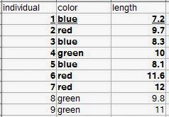 |
| Let's say all nine rows are our population. The bold observations are the sampled individuals (we were only able to measure seven). The underlined row is one individual observation. |
Section 2.2: variables in biology
They begin to discuss types of variables such as quantitative, qualitative, continuous, and discontinuous (meristic) variables. In R, you can include all these types of variables. Create a sample dataset and then look at how R categorizes them.individual<-c(1:9)
color<-c("blue","red","blue","green","blue","red","red","green","green")
length<-c(7.2, 9.7, 8.3, 10, 8.1, 11.6, 12, 9.8, 11)
numbereggs<-c(1,3,2,4,2,4,5,3,4)
dataset<-data.frame(individual,color,length,numbereggs)
str(dataset)
#'data.frame': 9 obs. of 4 variables:
#$ individual: int 1 2 3 4 5 6 7 8 9
#$ color : Factor w/ 3 levels "blue","green",..: 1 3 1 2 1 3 3 2 2
#$ length : num 7.2 9.7 8.3 10 8.1 11.6 12 9.8 11
#$ numbereggs: num 1 3 2 4 2 4 5 3 4
#Notice that individual is an integer, as it was created 1:9.
#If these numbers were tag numbers, or something where you might later add identifying letters,
#you can convert it to a factor.
dataset$individual.f<-factor(dataset$individual)
str(dataset)
#'data.frame': 9 obs. of 5 variables:
# $ individual : int 1 2 3 4 5 6 7 8 9
#$ color : Factor w/ 3 levels "blue","green",..: 1 3 1 2 1 3 3 2 2
#$ length : num 7.2 9.7 8.3 10 8.1 11.6 12 9.8 11
#$ numbereggs : num 1 3 2 4 2 4 5 3 4
#$ individual.f: Factor w/ 9 levels "1","2","3","4",..: 1 2 3 4 5 6 7 8 9
#Hmm, number eggs is still counted as a number. What if we need it as an integer?
dataset$numbereggs.int<-as.integer(dataset$numbereggs)
#I always put it in a new column in case I mess something up, I still have the original data.
str(dataset)
#'data.frame': 9 obs. of 6 variables:
# $ individual : int 1 2 3 4 5 6 7 8 9
#$ color : Factor w/ 3 levels "blue","green",..: 1 3 1 2 1 3 3 2 2
#$ length : num 7.2 9.7 8.3 10 8.1 11.6 12 9.8 11
#$ numbereggs : num 1 3 2 4 2 4 5 3 4
#$ individual.f : Factor w/ 9 levels "1","2","3","4",..: 1 2 3 4 5 6 7 8 9
#$ numbereggs.int: int 1 3 2 4 2 4 5 3 4
#numbereggs.int is now an integer.
#So, even if R doesn't correctly read your data the first time,
#you can finagle it into the right format for any analyses.
There are also the scales of measurement. Nominal scales do not have an implied ordering. For example, sites might not need an ordering. Or, there might be a directional ordering that is not evident from the site name (which R would automatically order alphabetically).
#Create a site variable.
dataset$site<-c("Texas","Oklahoma","South Dakota", "Manitoba", "Kansas","Oklahoma","South Dakota", "Manitoba", "Iowa")
str(dataset$site)
#chr [1:9] "Texas" "Oklahoma" "South Dakota" "Manitoba" "Kansas" "Oklahoma" "South Dakota" "Manitoba" "Iowa"
#It lists them as characters ("chr"), which can be useful sometimes (some functions will give errors if you have factors
#versus characters, so knowing how to convert is useful.)
dataset$site.f<-as.factor(dataset$site)
str(dataset$site.f)
#Factor w/ 6 levels "Iowa","Kansas",..: 6 4 5 3 2 4 5 3 1
#Note that it represents them as numbers, which is part of the reason it's sometimes useful to leave things as factors.
#1 is Iowa and Texas is 6, so it is ordered alphabetically.
#If you want to go from factor to character, use as.character
dataset$site.chr<-as.character(dataset$site.f)
str(dataset$site.chr)
#Anyway, to change the order on our factors, we need to use levels and factor.
levels.site<- c("Texas","Oklahoma","Kansas", "Iowa", "South Dakota", "Manitoba")
dataset$site.f.ordered<-factor(dataset$site.f, levels=levels.site, ordered=TRUE)
str(dataset$site.f.ordered)
#Now it's a categorical/ordinal variable in order from south to north!
# Ord.factor w/ 6 levels "Texas"<"Oklahoma"<..: 1 2 5 6 3 2 5 6 4
Section 2.3: accuracy and precision of data
The main implementation in this section is rounding, which has a convenient function.#For significant digits:
signif(dataset$length, digits=1)
#For simple rounding, digits is the number of decimal places.
round(dataset$length, digits=0)
round(dataset$length, digits=-1)
Section 2.4: derived variables
This section is about creating variables from each other, such as ratios or rates. I'll just show how to calculate a new variable from two variables. As the section points out, you want to make sure that using a ratio or rate is actually telling you something different than the measurements themselves, and remember that they are not really continuous variables.dataset$eggsperlength<-dataset$numbereggs/dataset$length
#Divide one variable by another and assign it to a new variable
#within a dataframe to get a ratio variable.
Section 2.5: frequency distributions
This section is a brief introduction to frequency distributions. The book gets more into these in Chapters 5 and 6. They show frequencies in several ways: tabular form, histograms, bar diagrams (bar plots), frequency polygons, dot plots, and stem-and-leaf displays. I'll focus here on how to generate each of these.#A frequency table can be created using table().
color.freqs<-table(dataset[,"color"])
#This is equivalent to Table 2.1 showing a qualitative frequency distribution.
#For a quantitative frequency distribution of a
#meristic (discontinuous) variable (as in Table 2.2), do the same thing.
length.freqs<-table(dataset[,"numbereggs"])
#For quantitative frequency distributions of continuous variables,
#Box 2.1 explains how to classify by classes.
#We'll use their data this time.
aphid.femur<-c(3.8,3.6,4.3,3.5,4.3,
3.3,4.3,3.9,4.3,3.8,
3.9,4.4,3.8,4.7,3.6,
4.1,4.4,4.5,3.6,3.8,
4.4,4.1,3.6,4.2,3.9)
#How about the tables?
table(aphid.femur)
#This reproduces the original frequency distribution but omits the zeroes.
#A google search for brings us to this website:
#http://www.r-tutor.com/elementary-statistics/quantitative-data/frequency-distribution-quantitative-data
hist(aphid.femur,
breaks=seq(from=3.25, to=4.85, by=0.1),
col="gray",
main="",
xlab="Femur length in mm",
ylim=c(0,10)) #This is so we can add the second graph on next.
hist(aphid.femur,
breaks=seq(from=3.25, to=4.85, by=0.3),
main="",
add=TRUE)
#I found this website helpful when learning to make the histograms:
#http://www.r-bloggers.com/basics-of-histograms/
#Additionally, you can just uses breaks=n, where n is the number of breaks you want,
#instead of specifying as I did above to create the figure as in Box 2.1.
#Stem-and-leaf displays can also show the distribution of data.
stem(dataset$length, scale = 1, width = 100, atom = 1e-08)
#Changing scale makes the plot expanded or squished together.
#Scale=1 seems best for making a stem-and-leaf plot as you would by hand.
#width is "Desired width of the plot" according to help. I am not entirely sure what it does.
#When I make it too small, numbers on the right side of the stem disappear. Making it larger
#doesn't change anything but add those back.
#Back-to-back stem-and-leaf plots are discussed on page 29
#as a way to compare two samples.
#Base R does not include a way to do these, but a quick google search shows
#http://cran.r-project.org/web/packages/aplpack/index.html
#Bar diagrams (or bar plots) are for meristic (discontinuous) variables.
#Let's the frequency table we made above because barplot requires a frequency table.
barplot(color.freqs,
ylab="Count",
xlab="Color")
#We have three of each, so let's
#try it again with something more complicated:
site.freqs<-table(dataset[,"site.f.ordered"])
barplot(site.freqs,
ylab="Count",
xlab="Sites south to north")
#Instead of bars to represent a continuous distribution, as in a histogram,
#there is also the frequency polygon.
#Let's look at the histogram for five classes again and make the polygon like that.
hist(aphid.femur,
breaks=seq(from=3.25, to=4.85, by=0.3),
main="5 classes",
xlab="Femur length in mm",
add=FALSE)
#We'll need to load the ggplot2 library.
library(ggplot2)
#And make the aphid.femur data into a dataframe.
aphid.df<-data.frame(aphid.femur)
ggplot(aphid.df, aes(x = aphid.femur)) +
geom_freqpoly(binwidth=0.1) +
theme(
panel.background = element_blank(),
panel.grid = element_blank(), #These theme lines get rid of the standard gray background in ggplot
axis.line = element_line() #and this returns the axis lines that removing the grid also removes.
)+
labs(x = "Aphid femur in mm", y = "Frequency")
#Finally, dot plots (examples in Figures 2.1a and 2.1b for two different sample sizes).
#While R often automatically plots dots with plot(), it doesn't necessarily give us the frequency plot we want.
plot(aphid.femur)
#See, the figure is in order of "Index", which is the order of the points in the dataset.
#It doesn't seem quite possible to make a figure just like the one in the book,
#but we can get pretty close.
stripchart(aphid.femur,
method="stack",
at=0,
xlab="Aphid femur in mm",
ylab="Frequency")
#This is nice, but doesn't show the frequency counts.
plot(sort(aphid.femur),
sequence(table(aphid.femur)),
cex=2.5,
pch=21,
bg="black", #these three lines make the dots larger and filled, hence easier to see.
xlab="Aphid femur in mm",
ylab="",
yaxt="n") #suppress the y-axis or it'll put decimal places.
mtext(side = 2, #left side (y-axis)
las=1, #rotate the axis title so it's horizontal.
expression(italic(f)), #make the f italicized as in Figure 2.1, just for an example.
cex=1.5, #increase size of the label.
line=2) #if it's at 1 it sits right on the axis where it's hard to read. Adjust as needed.
axis(side=2,
las=1,
at=c(1,2,3,4)) #re-add the y-axis with integers for our counts.
#This is more like it!
Exercises 2 (selected)
I'll do the ones that I can demonstrate in R.#Exercise 2.2
#Round the following numbers to three significant digits.
e2.2<-c(106.55, 0.06819, 3.0495, 7815.01, 2.9149, 20.1500)
signif(e2.2, digits=3)
#[1] 1.07e+02 6.82e-02 3.05e+00 7.82e+03 2.91e+00 2.02e+01
#Then round to one decimal place.
round(e2.2, digits=1)
#[1] 106.5 0.1 3.0 7815.0 2.9 20.1
#Exercise 2.4
#Group the 40 measurements of interorbital width of a sample of pigeons.
#Frequency distribution and draw its histogram.
e2.4<-c(12.2, 12.9, 11.8, 11.9, 11.6, 11.1, 12.3, 12.2, 11.8, 11.8,
10.7, 11.5, 11.3, 11.2, 11.6, 11.9, 13.3, 11.2, 10.5, 11.1,
12.1, 11.9, 10.4, 10.7, 10.8, 11.0, 11.9, 10.2, 10.9, 11.6,
10.8, 11.6, 10.4, 10.7, 12.0, 12.4, 11.7, 11.8, 11.3, 11.1)
#Frequency distribution
table(e2.4)
#Histogram
#Used the high and low values from the frequency distribution
#to choose the breaks. Since it's one decimal place,
#the 0.1 classes seem logical.
hist(e2.4,
breaks=seq(from=10, to=13.4, by=0.1),
col="gray",
main="",
xlab="Interorbital width for domestic pigeons (mm)")
#Exercise 2.6
#Transform exercise 2.4 data with logarithms and make another frequency distribution and histogram.
e2.6<-log(e2.4) #note that R uses the natural log (ln).
table(e2.6)
#To show them in the same window, use par to set number of rows and columns visible.
par(mfrow=c(2,1))
#To compare with the same number of breaks, use length.out to specify how many breaks.
#Using the width of each class would be harder since transforming shifts the data
#to a different range of numbers.
hist(e2.4,
breaks=seq(from=min(e2.4), to=max(e2.4), length.out=15),
col="gray",
main="",
xlab="Interorbital width for domestic pigeons (mm)")
hist(e2.6,
breaks=seq(from=min(e2.6), to=max(e2.6), length.out=15),
col="gray",
main="",
xlab="Interorbital width for domestic pigeons (mm) (ln-transformed)")
#Now the data seem to be a bit more centered.
#We can't really plot them over each other like we did earlier with classes
#because the transformed values shift their range so much.
#Put the single plot back in case you want to plot more the regular way.
par(mfrow=c(1,1))
#Exercise 2.7
#Get data from exercise 4.3.
e2.7<-c(4.32, 4.25, 4.82, 4.17, 4.24, 4.28, 3.91, 3.97, 4.29, 4.03, 4.71, 4.20,
4.00, 4.42, 3.96, 4.51, 3.96, 4.09, 3.66, 3.86, 4.48, 4.15, 4.10, 4.36,
3.89, 4.29, 4.38, 4.18, 4.02, 4.27, 4.16, 4.24, 3.74, 4.38, 3.77, 4.05,
4.42, 4.49, 4.40, 4.05, 4.20, 4.05, 4.06, 3.56, 3.87, 3.97, 4.08, 3.94,
4.10, 4.32, 3.66, 3.89, 4.00, 4.67, 4.70, 4.58, 4.33, 4.11, 3.97, 3.99,
3.81, 4.24, 3.97, 4.17, 4.33, 5.00, 4.20, 3.82, 4.16, 4.60, 4.41, 3.70,
3.88, 4.38, 4.31, 4.33, 4.81, 3.72, 3.70, 4.06, 4.23, 3.99, 3.83, 3.89,
4.67, 4.00, 4.24, 4.07, 3.74, 4.46, 4.30, 3.58, 3.93, 4.88, 4.20, 4.28,
3.89, 3.98, 4.60, 3.86, 4.38, 4.58, 4.14, 4.66, 3.97, 4.22, 3.47, 3.92,
4.91, 3.95, 4.38, 4.12, 4.52, 4.35, 3.91, 4.10, 4.09, 4.09, 4.34, 4.09)
#Make a stem-and-leaf display.
stem(e2.7, scale = 1, width = 100, atom = 1e-08)
#Create an ordered array. This in R would be something like a vector,
#which is what we'll make.
e2.7.ordered<-sort(e2.7) #order is a similar function, but for dataframes.
e2.7.ordered
#You can see how it matches up with the stem-and-leaf display, as it should.
That's all for Chapters 2 and 3.
Sunday, May 25, 2014
First paper from my dissertation out in American Midland Naturalist!
I am delighted to announce that the first paper from my Ph.D. dissertation is now out in American Midland Naturalist. This is "Current and historical extent of phenotypic variation in the Tufted and Black-crested Titmouse (Paridae) hybrid zone in the southern Great Plains" (Curry and Patten 2014). This paper covers my second chapter and features a map of the current extent of the hybrid zone with previous records from Dixon's original 1955 monograph on the titmouse hybrid zone. We also compare cline widths and do quantitative analyses of the plumage and morphology of the two populations. Please check it out!
Saturday, May 24, 2014
Using R to work through Sokal and Rohlf's Biometry: Chapter 1
I am wanting to brush up on my statistics and get a better mechanistic understanding of tests I'm using, and learn new tests and theory, so I have decided to work through Sokal and Rohlf's Biometry, 4th edition. I hope you will find this as helpful as I am sure I am going to find it. I'll do one chapter at a time; or if some turn out to be really long, possibly even break them up further into sections.
To start, with a really short one, Chapter 1 reviews some general terminology (biometry as the measuring of life; hence the book focusing on statistics as applied to biology). Data are plural; a datum is singular! Statistics is the study of "data describing natural variation" by quantifying and comparing populations or groups of individuals. Section 1.2 covers the history of the field and 1.3 discusses "The statistical frame of mind", which justifies why we use statistics. (Short answer: To quantify relationships in terms of probability, allowing us to better understand relationships among variables of interest.)
To start, with a really short one, Chapter 1 reviews some general terminology (biometry as the measuring of life; hence the book focusing on statistics as applied to biology). Data are plural; a datum is singular! Statistics is the study of "data describing natural variation" by quantifying and comparing populations or groups of individuals. Section 1.2 covers the history of the field and 1.3 discusses "The statistical frame of mind", which justifies why we use statistics. (Short answer: To quantify relationships in terms of probability, allowing us to better understand relationships among variables of interest.)
Saturday, April 26, 2014
Developing functions, getting results out of them, and running with an example on canonical correlation analysis
Functions, lists, canonical correlation analysis (CCA)... how much more fun can one person have?
R comes with a variety of built-in functions. What if you have a transformation you want to make manually, though? Or an equation? Or a series of functions that always need performed together? You can easily make your own function. Here I'll show you how to how to develop a function that gets you all of the results if you need to run multiple CCAs. You then can run a CCA on your own using the one-time code, using the function, or make your own function for something else.
#First, we need some sample data.
yourdata<-data.frame(
c(rep(c("place1", "place2"), each=10)),
c(rep(c(1.2,2.7,3.3,4.9), each=5)),
c(rnorm(20,mean=0, sd=1)),
c(rep(c(1.2,4.4,2.9,7.6), 5)),
c(rep(c(5.7,6.2,7.1,8.1), each=5))
)
#Generating four columns of random and non-random numbers and
#one column of grouping variables for later subsetting of the data.
colnames(yourdata)<-c("subset", "var1", "var2", "with1", "with2")#Naming the columns for later use.
#Now test out canonical correlation.
vars<-as.matrix(cbind(yourdata[,c("var1","var2")]))
withs<-as.matrix(cbind(yourdata[,c("with1","with2")]))
results<-cancor(vars, withs)
results #view the results
#Okay, we get some results.
#But what about when we want to run this with different variables?
#It might be easier, if we're going to need to do the same set of commands
#repeatedly, to make a function. Functions automate a process.
#For example, let's say we always want to add two variables (a and b).
#Every time, we could just do this:
a<-1
b<-2
c<-a+b
#But what about next time when we need a=2 and b=5?
#We'd have to re-set the variables or make new ones.
#It'd be easier to create an adding function.
adding<-function(a,b){ #name the function ('adding')
#function with the variables you can input in parentheses (here a and b)
#followed by a curly bracket.
a+b #This tells you what the function will do with your input variables.
} #Close the curly brackets.
adding(a=2,b=5)
#This is a very simple example, but the concept holds.
#Take a process and automate it. Now we'll automate our CCA code from above.
canonical.corr.simple<-function (var, with, dataframe) {
#function name and the variables we can input.
#The next four lines are the same thing we did earlier to get CCA results,
#but with the standardized variable names.
var.original<-as.matrix(cbind(dataframe[,var]))
with.original<-as.matrix(cbind(dataframe[,with]))
results.cancor<-cancor(var.original,with.original)
results.cancor
}
#Now you can run it using input variables.
var.variables<-c("var1", "var2")
with.variables<-c("with1", "with2")
function.results<-canonical.corr.simple(var=var.variables,
with=with.variables,
dataframe=yourdata)
function.results
function.results$cor #You can access different pieces of the function results this way.
function.results$cor[1]
#Use this list notation (I'll get more into it later) to get very specific pieces of the results.
#This is useful because now you can run the same function
#more than once using different input objects.
#However, you'll notice that if you try to access any objects
#internal to the function, you get an error.
#This is annoying if we want to keep our results,
#especially once we make a more complicated function where we need results
#that are not in the final printout.
var.original
#Error: object 'var.original' not found
#This means that the internal objects haven't been created in our workspace.
#To access them for later analysis, you'll need to return these values as a list.
canonical.corr.listreturn<-function (var, with, dataframe) {
var.original<-as.matrix(cbind(dataframe[,var]))
with.original<-as.matrix(cbind(dataframe[,with]))
results.cancor<-cancor(var.original,with.original)
results.list<-list(results.cancor,
var.original,
with.original)
return(results.list)
}
#Test out the function!
results.yeah<-canonical.corr.listreturn(var=var.variables,
with=with.variables,
dataframe=yourdata)
#If you do not assign your results to an object,
#it will just print them and you can't access the list.
#Sometimes I forget this and try to ask for "results.list"
#in the function, but that won't work if you
#don't assign your results to an object like I did here.
#So then type out your object name. It is now a list with three main elements.
results.yeah
#Yep. Lots of info. But how to we get individual pieces of the list?
#First it helps to know the structure of the list.
str(results.yeah)
#List of 3
#$ :List of 5
#..$ cor : num [1:2] 0.98 0.104
#..$ xcoef : num [1:2, 1:2] -0.1714 0.0226 -0.0144 0.1979
#.. ..- attr(*, "dimnames")=List of 2
#.. .. ..$ : chr [1:2] "var1" "var2"
#.. .. ..$ : NULL
#..$ ycoef : num [1:2, 1:2] -0.00089 -0.24404 0.09633 -0.04365
#.. ..- attr(*, "dimnames")=List of 2
#.. .. ..$ : chr [1:2] "with1" "with2"
#.. .. ..$ : NULL
#..$ xcenter: Named num [1:2] 3.025 0.0977
#.. ..- attr(*, "names")= chr [1:2] "var1" "var2"
#..$ ycenter: Named num [1:2] 4.03 6.78
#.. ..- attr(*, "names")= chr [1:2] "with1" "with2"
#$ : num [1:20, 1:2] 1.2 1.2 1.2 1.2 1.2 2.7 2.7 2.7 2.7 2.7 ...
#..- attr(*, "dimnames")=List of 2
#.. ..$ : NULL
#.. ..$ : chr [1:2] "var1" "var2"
#$ : num [1:20, 1:2] 1.2 4.4 2.9 7.6 1.2 4.4 2.9 7.6 1.2 4.4 ...
#..- attr(*, "dimnames")=List of 2
#.. ..$ : NULL
#.. ..$ : chr [1:2] "with1" "with2"
#So, how do we get stuff out of this structure?
results.yeah[1]
#This is the whole first element.
#You can see its structure, too:
str(results.yeah[1])
#It has five elements, and more within each of those.
#To go farther into the list, use the square brackets.
#You need two around each except for the last element.
results.yeah[[1]][1]
#We got $cor! Woohoo! To get only the first $cor, try this:
results.yeah[[1]][[1]][1]
#Now just test out which pieces of the list you want using the data from str().
results.yeah[[1]][2]
#For example, the second element at this level is $xcoef.
#Sometimes I have to experiment with it a little to find what I want, but just remember
#it's got a structure, so you will be able to find what you need.
#Once you've messed around with that a bit to see
#how you can get to the various pieces you want,
#let's move on to making a more complete CCA function to use.
#This one will have spots for transformed and untransformed variables
#in case you need to transform any of your data and
#will output additional statistics to include in your work.
yourdata.transforms<-yourdata
yourdata.transforms$lnwith2<-log(yourdata.transforms$with2)
#R uses the natural log
#Now we have example data with one transformed variable.
#Select the columns you want.
var.variables<-c("var1","var2")
with.variables<-c("with1","lnwith2") #note I've selected one transformed variable.
#These are your variables. You are correlating the with and var variate
#for the with and var variables. That is, the two var variables will be combined into a single
#variate. The same thing is done to the with variables (they are combined into a with variate
#that extracts as much variance as possible from the variables).
#Select columns for untransformed variables.
var.variables.untransformed<-c("var1","var2")
with.variables.untransformed<-c("with1","with2")
#note I've selected both untransformed variables.
#You need to do this so that you can get loadings of the variables on the variates
#for interpretation of the variates.
#Select any subsetting. Here I will use data from either place1 or place2
#(all the data), but you can use this to select data from particular sites or groups.
subsetting.all<-c(yourdata.transforms$subset=='place1'|yourdata.transforms$subset=='place2')
#That vertical line is "or".
#Make some variable names for when we get to graphing just to keep track.
graphing.variable.names<-c("var-variate", "with-variate")
#Make sure you have downloaded and installed the packages 'yacca' and 'CCP'
#if you don't already have them.
canonical.corr<- function (var,
with,
var.untransformed,
with.untransformed,
variablenames,
dataframe,
subsetting) {
var.original<-as.matrix(cbind(dataframe[subsetting,var])) #subsetting selects rows
with.original<-as.matrix(cbind(dataframe[subsetting,with]))
results.cancor<-cancor(var.original,with.original)
rho<-cancor(var.original,with.original)$cor
N<-dim(var.original)[1]
p<-dim(var.original)[2]
q<-dim(with.original)[2]
#These four lines are needed for the below two, to get a Wilks' lambda.
library(CCP)
cancorresults<-p.asym(rho,N,p,q,tstat="Wilks")
library(yacca)
results.yacca<-cca(var.original,with.original)
#easiest version of cancor! gives correlations.
#Use CCP library for additional test stats if needed, because cca() will only give Rao's
#(related to and same value as Wilks).
#To see structural correlations (loadings) for how X and Y variables change with variates,
#get redundancy. Interpret loadings that are |r| equal to or greater than 0.33.
#If input variables are transformed, then need to do a Pearson's correlation on original variable
#and appropriate canonical variate.
var_expl<-cbind('x.redundancy'=results.yacca$xvrd, 'y.redundancy'=results.yacca$yvrd)
#Canonical redundancies for x variables
#(i.e., total fraction of x variance accounted for by y variables, through each canonical variate)
#yvrd = Canonical redundancies for y variables (i.e., total fraction of y variance accounted for by x variables, through each canonical variate).
#y is with, so y.redundancy is amount of with variance accounted for by var variance.
#x is var, so x.redundancy is amount of var variance accounted for by with variance.
var_expl #prints
cancor.variates<-cbind('canonical.correlation'=results.yacca$corr,
#report this
'overlappingvariance.corrsq'=results.yacca$corrsq,
#canonical correlation with THIS % overlapping variance
'variance.in.x.from.x.cc'=results.yacca$xcanvad,
#amount of x variate accounted for by x variables
'variance.in.y.from.y.cc'=results.yacca$ycanvad
# amount of y variate accounted for by y variables
)
CC1x<-as.matrix(results.yacca$canvarx)
CC1x
CC1y<-as.matrix(results.yacca$canvary)
with.loadings<-cor(CC1y,dataframe[subsetting,with.untransformed],method="pearson")
# this gives hybrid index (y, with) loadings for untransformed data.
#is same as loadings in the original redundancy analysis because there was no transformation.
var.loadings<-cor(CC1x,dataframe[subsetting,var.untransformed],method="pearson")
# this gives song (x, var) loadings for untransformed data.
#Used in interpreting graph because of transformation.
Yplot<-data.frame(CC1x[,1])
Xplot<-data.frame(CC1y[,1])
graphing<-cbind(Xplot, Yplot) #This gives you data you can plot.
colnames(graphing)<-variablenames #This gives you names of your variables.
results.list<-list(cancorresults,
var_expl,
var.loadings,
with.loadings,
graphing,
cancor.variates)
return(results.list)
}
long.results<-canonical.corr(var=var.variables,
with=with.variables,
var.untransformed=var.variables.untransformed,
with.untransformed=with.variables.untransformed,
variablenames=graphing.variable.names,
dataframe=yourdata.transforms,
subsetting=subsetting.all
)
long.results #look at our results here. You can see the range of results we extracted.
str(long.results) #and the structure.
#First, is it significant?
long.results[[1]]$p.value[1] #This gets the first variate.
#long.results[[1]]$p.value[2] gets the second.
#long.results[[1]]$p.value gets all the variates' p-values.
#long.results[[1]] shows you all the degrees of freedom and Wilks test statistic that you need to report.
long.results[[2]] #shows the redundancy analysis. How much of X is explained by y?
#This is what I commented in the function, but I'll repeat here:
#total fraction of y or x variance accounted for by x or y variables,
#through each canonical variate).
#y is with, so y.redundancy is amount of with variance accounted for by var variance.
#x is var, so x.redundancy is amount of var variance accounted for by with variance.
#Loadings for each variate. Interpret loadings higher than |0.33| for significant variates.
long.results[[3]] #Loadings for var variables on each canonical variate (CV1 and CV2 in this case)
long.results[[4]] #Loadings for with variables on each canonical variate (CV1 and CV2 in this case)
#How about graphing? Here's a very simple plot. It uses the variable names we made earlier
#and plots CCI of each variate.
plot(long.results[[5]])
long.results[[6]] #Finally some more interpretative stats.
#The first two are the canonical correlation and overlapping variance (correlation squared).
#The last two are the variance explained by the variables within its own variate.
#variance.in.x.from.x.cc is how much of the "var" variables (x) is explained by its variate.
#Same for y ("with") variance.in.y.from.y.cc.
This last function (canonical.corr) is the code I use to run canonical correlation analysis in my work currently. You can read the help files for the CCA functions within it if you need to extract additional statistics for your particular analysis; just write them into the function and add them to the results list that is returned.
Subscribe to:
Posts (Atom)