1. R code for formatting the data
My data are usually in column form, with each level and group as factors in two additional columns. To get to the one-column-per-group needed for a profile analysis, I use the reshape2 package. Follow the instructions in the melting post. (I'll use that dataset here.)Once you have your data in the correct format, you can export it to a .csv text file. Make sure you have your workspace set to where you want the file to go. (I usually do this step at the beginning when I import data, but since we generated our dataset in R, the workspace needs to be set here.)
setwd("C:\\Users\\Claire\\Documents\\")
#make sure you use two backslashes, not one.
write.csv(data.columns,file="20140116_profile_analysis.csv", na=".")
#Writes a file that can easily be imported into SAS.
#Note the na="." part, which gives periods for missing data as SAS prefers.
#My sample dataset doesn't have this, but I've left it in for when I do have a set with missing data.
#(SAS will not use those individuals in the profile analysis.)
#The file will be written to your working directory.
#You can now import it into SAS.
2. SAS code for analysis
The code is adapted with little change from Tabachnik and Fidell (2007), who also explain further tests you can do for your analysis.
proc glm data=whereyoukeepyourdata.dataset;
/*The profile analysis uses proc glm.*/
class levels;
/*In the class statement, levels is the variable name of you want your levels to be.*/model group1 group2 group3 group4 = levels;
/*The model statement tells you what you are testing. Here you want levels to be run on the four test grouping variables.*/
repeated teststimulus 4 profile;
/*This names the test1-4 variables (grouping/subtest/whatever you want to call it), so pick a descriptive name that will make interpreting your results easier. The number after it (4) is how many groups you have. The 'profile' turns it into a profile analysis */
title 'profile analysis';
/*This line is not required, but it makes the results easier to find if you are running more than one analysis.*/
run;
/*runs the test*/
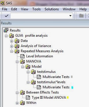
Here is where you get the output. I highlight the tests for flatness (gray), parallelism (blue), and levels (yellow),
MANOVA Test Criteria and Exact F Statistics for the Hypothesis of no teststimulus Effect
H = Type III SSCP Matrix for teststimulus
E = Error SSCP Matrix
S=1 M=0.5 N=2
Statistic Value F Value Num DF Den DF Pr > F
Wilks' Lambda 0.37200666 3.38 3 6 0.0955
Pillai's Trace 0.62799334 3.38 3 6 0.0955
Hotelling-Lawley Trace 1.68812389 3.38 3 6 0.0955
Roy's Greatest Root 1.68812389 3.38 3 6 0.0955
MANOVA Test Criteria and Exact F Statistics for the Hypothesis of no teststimulus*levels Effect
H = Type III SSCP Matrix for teststimulus*levels
E = Error SSCP Matrix
S=1 M=0.5 N=2
Statistic Value F Value Num DF Den DF Pr > F
Wilks' Lambda 0.37476423 3.34 3 6 0.0975
Pillai's Trace 0.62523577 3.34 3 6 0.0975
Hotelling-Lawley Trace 1.66834432 3.34 3 6 0.0975
Roy's Greatest Root 1.66834432 3.34 3 6 0.0975
The GLM Procedure
Repeated Measures Analysis of Variance
Tests of Hypotheses for Between Subjects Effects
Source DF Type III SS Mean Square F Value Pr > F
levels 1 57.34512196 57.34512196 19.96 0.0021
Error 8 22.98499258 2.87312407
You then use the data from each to calculate your effect sizes.
Flatness η2= 1 - lambda
η2= 1- 0.37200666
η2= 0.6279933
Parallelism partial η2= 1 - lambda ^ (1/2)
partial η2= 1- 0.37476423 ^ (1/2)
partial η2= 0.3878201
Levels
η2= SS between groups / (SS between groups + SS within groups)
η2= 57.34512196 / (57.34512196 + 22.98499258)
η2= 0.7138683
3. R code for figure
This is based on the U. Florida page that I mentioned above.
#First take the data.columns and add some information on any symbols or color scheme.
#Here I'm coloring the two levels and
#adding line types (even-numbered individuals are dashed, odd are solid).
data.columns$levels.color<-data.columns$levels
data.columns$levels.color<-sub("A","blue",data.columns$levels.color)
data.columns$levels.color<-sub("B","orange",data.columns$levels.color)
data.columns$additional.linetype<-rep(c("solid", "dashed"), 5)
figure.profile<-data.columns[,c("group1",
"group2", "group3", "group4",
"additional.linetype", "levels.color")]
#Make a small matrix with just the variables needed, using the melted dataset from step 1.
#I also include two additional variables for graphing: linetype and color.
#You can code these into a new column using your factors from the original dataset.
#Some objects need to be calculated for later plotting.
(p<-ncol(figure.profile[,1:4]))
#This counts number of subscores/groups (test stimuli),
#but only the first four columns because the last two are not the data.
#Now you can create the main body of the figure.
matplot(1:p, t(as.matrix(figure.profile[,1:4])),
#1:p counts the groups, here used as the number of positions on the x-axis.
#t() transposes the matrix (created from the dataframe by as.matrix
#and using the column selection [,1:4] makes sure you only select the data columns
#and not our symbol information columns.
type="l", lwd=1, # says this is a line graph (type="l") with line width of 1.
lty=as.character(figure.profile$additional.linetype),
#the line type is given by a variable in my dataset.
#In this case, it is not part of the profile analysis,
#but is there just for visual interpretation.
#You could also use different line types to represent
#the different levels instead of color.
#That would be particularly good
#if you need a black-and-white figure for publication.
#as.numeric is needed for it interpret it correctly.
col=as.character(figure.profile$levels.color),
#Again, another symbol defined by a column in the dataset.
#I needed as.character to make sure it reads the factor as
#characters, otherwise it (sometimes) gives an error
#depending on the data type in the column.
xaxt="n", #no x-axis (you'll be adding this manually soon)
main="Profile analysis",
xlab="Subtest/the repeated measurement/groups",
ylab="Dependent variable")
axis(1, 1:p, colnames(figure.profile[,1:4]))
# Add x-axis labels.
#1 is the position (the x-axis on bottom), 1:p says how many labels to add,
#and colnames takes the names from the dataset's grouping columns.
#You could also write replace colnames(figure.profile[,1:4]) with a list
#if your column names aren't tidy enough.
#axis(1, 1:p, c("Group 1", "Group 2", "Group 3", "Group 4"))
(x.bar <- by(figure.profile[,1:4], data.columns$levels, colMeans))
#Take the mean for each level across the columns 1:4 (the groups) of the matrix from above.
#The original code says to use mean but mean only works with vectors;
#colMeans works on a dataframe, which is what we have.
lines(1:p, x.bar[[1]], lwd=3, col="blue")
lines(1:p, x.bar[[2]], lwd=3, col="orange")
#These have thicker line widths (lwd=3 instead of 1) to make them stand out
#from the lines that we plotted to represent each sample.
legend("topleft", c("A", "B"), col=c("blue","orange"), lwd=3, title="Levels")
#If appropriate, add a legend to some position (here top left, but you can change this).
You now have significance tests for parallelism, levels, and groups (shown in the caption), and a clear figure showing the levels and groups for each sample and the averages. (Your data will turn out a little different because the dataset was randomly generated in R, though the approximate differences should be the same since we set the means and standard deviations at the same values each time.)
 |
There is no significant interaction between levels and groups (parallelism test) (Wilks'
Λ=0.37, df=3,6, p=0.10, partial η2=0.39). There
is no significant difference between responses to the test groups (flatness test) (Wilks' Λ=0.37, df=3,6,
p=0.10, η2=0.). There is a significant difference between levels (difference in levels test) (F1,8=19.96,
p=0.002, η2=0.71).
|
No comments:
Post a Comment
Comments and suggestions welcome.